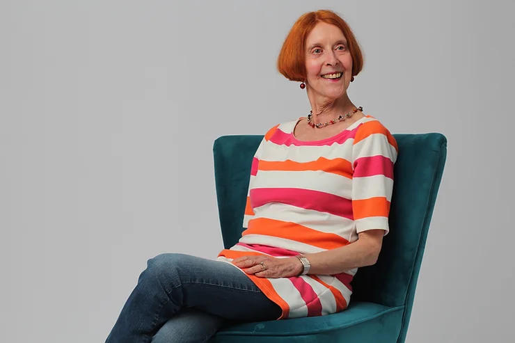
Helga Joergens
Interview with Cultural Dose
Prepare to delve into the mesmerizing realm of Helga Joergens’ artistic journey as she shares her inspirations and creative process in an interview with Cultural Dose as she features on our Spring 24 cover. From the enchanting allure of Salvador Dalí’s surreal landscapes to the profound impact of her academic studies, Joergens offers a captivating glimpse into the genesis of her extraordinary artistry. Join us as we unravel the mysteries of her imagination, where every stroke of the brush beckons us into a world where reality and dreams converge with breathtaking beauty.
WHEN DID YOUR ART JOURNEY BEGIN?
My journey into art started with a school trip with my art teacher and interested students to Amsterdam, Rotterdam and The Hague when I was 16 years old. At the Museum Boijmans Van Beuningen in Rotterdam, I was introduced to Surrealism when I saw, for the first time, paintings by Salvador Dalí, for example Espagne, 1938, [https://www.boijmans.nl/en/collection/artworks/4294/espagne].
A year later, in 1971, my parents made it possible for me to visit the large major retrospective exhibition of Dalí’s work in Baden-Baden, Germany. The sheer artistic skill and the strangeness of his imagery, the combination of disparate elements as experienced in dreams, intrigued me. And it fascinated me that, although not depicting reality, his paintings contained a logic in their own right.
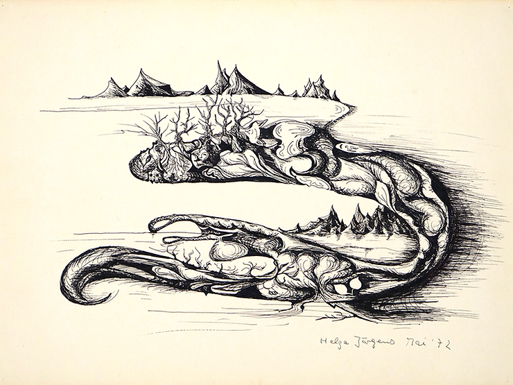
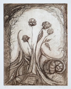
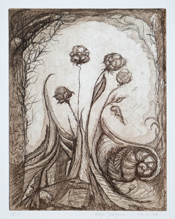
Surreal Landscape, Pen and ink
My first Surreal drawings seemed to have developed out of doodles. I started the composition Surreal Landscape, 1972, by drawing S-shaped lines which I combined to create volumes, filled with abstract forms and recognizable elements like mountains and trees – the bottom row of which seem to dance. Different landscapes on different scales and space levels appear. However, you need to refocus in order to detect faces, a rose, a dove-shape and leaves in sizes that don’t match the landscapes. And, sweeping your eyes to below left, the main form seems to end in a curled tail of a snake. The picture is full of surprises, and every area wants to be observed on its own. I enjoyed creating this constant change of scale bringing non-matching items together and astound the viewer while ‘walking’ with their eyes through the picture. By the way: The image of mountains rising out of a flat plain was directly inspired by Dalí’s paintings. I was fascinated by the contrast between the plain and the sudden rise of a mountain range.
For my birthday that year, my parents gave me a box of oil paints. It took me one or two pictures to become familiar with this lovely and responsive medium and then there was no stopping me.
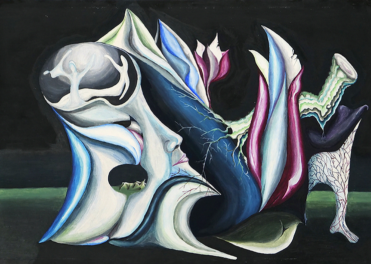
Dream, Oil on card board
The oil painting Dream, 1973, is an example of my Surreal paintings. I primed the cardboard backing of my paper drawing pad with oil-based primer, which my father used for painting our garden furniture. Carefully, I applied the white paint firstly in a vertical, then added a second layer in a horizontal direction. Thus, a slight structure appeared that resembled the weave of canvas. Later, I used ready-made primed canvas paper.
Here, we have a night scene in which you see a combination of large, unrelated items in a vast landscape. An abstract head, left, allows you a view into its ‘brain’ containing two figures. An oval opening in the jaw area leads your eye to a mountain range far in the distance. The head seems to be attached to buds and opening flowers, a tree trunk whose roots grow over a blue form and into the head. Beneath it on the far right, the whole structure is supported by a white leg. Its network of veins mirrors the roots of the tree, and the oval shape, which it frames, echoes the ovals on the left of the picture. However, all is not well because decay is setting in: the top petals of the flowers are damaged and the tree trunk has been cut: Growth and decay, life forces and death come together to create this dream.
HELGA, YOUR JOURNEY FROM STUDYING ART HISTORY AND MEDIEVAL GERMAN LITERATURE TO BECOMING AN ACCOMPLISHED ARTIST IS FASCINATING. COULD YOU SHARE WITH US SOME PIVOTAL MOMENTS OR INFLUENCES FROM YOUR ACADEMIC BACKGROUND THAT HAVE SHAPED YOUR ARTISTIC VISION?
The training of Art History at Göttingen University covers a wide-ranging spectrum: the study of sculpture, painting, drawing, printmaking as well as architecture and design, from Mediaeval art to Modernism and contemporary art gives the students a comprehensive knowledge base to enable them to progress into a wide choice of professions. It broadened my horizons and instilled in me the love of all aspects of art, architecture and design and familiarised me with these fields. I became particularly interested in Norman and Gothic art and architecture and loved the simplicity of the formal artistic language which conveyed deep emotions and humanity. Journeys to Burgundy and Brittany were early destinations in my research in this field. Visits to European and English cathedrals and museums followed in my quest to learn more about this period of art.
In 1980, I was given the opportunity to write a guidebook about the Monastery and Pilgrimage Church Nikolausberg, near Göttingen [Die Kloster- und Wallfahrtskirche Nikolausberg, Göttingen 1980] which owns three beautiful Mediaeval wooden sculptures and two splendid Gothic altarpieces.
This interest in Mediaeval art was mirrored by my interest in the literature of the same period, stories which contain a similar timelessness as Chaucer’s Canterbury Tales or Shakespeare’s works.
Another area of artistic interest became and still is the art of the 19th and 20th centuries – Impressionism and the Modern movements like Fauvism, Cubism, and German Expressionism, as well as craft and design from William Morris to the Bauhaus and beyond to contemporary art and design.
I always found it important to see original works of art, design and architecture. For many years, my holidays were mainly spent visiting places to observe great art and buildings. For instance, visiting the original Bauhaus School building (1925-26) in Dessau, Germany, designed by Walter Gropius, as well as several of his purpose-built houses for the Bauhaus Masters (including Vassily Kandinsky, Paul Klee, and Ludwig Mies van der Rohe) left me with an unforgettable impression. The principles of their modernity still influence public architecture and residential dwellings today. But most memorable were two journeys to New York, where my husband, the painter David Lendrum, and I explored the fantastic public art galleries and museums.
Examples of my art influenced by my studies
The following examples of a painting and prints show artworks which were inspired by my studies of the History of Art.
-

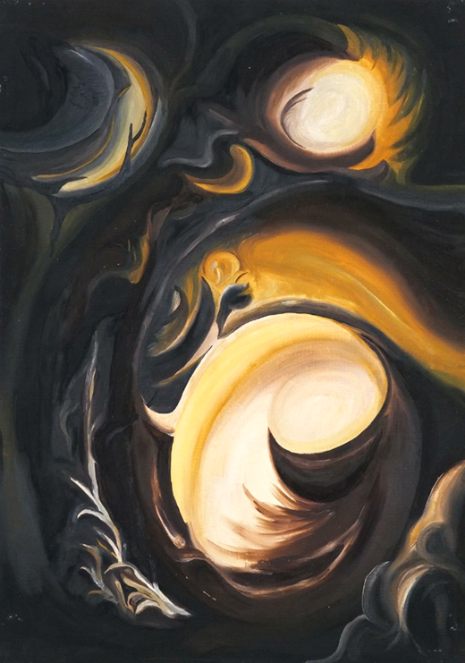
- Light, Oil on card board
-
- Satisfied, Monoprint on paper
My oil painting Light, 1974, brings a departure from Surrealism. Its composition is based on circular elements draped around each other. Bright light floods from ‘behind’ through two openings and shines into a complex organic space illuminating details.
This chiaroscuro effect, the contrast between bright light and deep darkness, was first depicted by the Italian master Caravaggio (1571-1610). However, the great Dutch painter Rembrandt van Rijn (1606-69) became aware of Caravaggio’s new invention through engravings of his paintings. He took up the idea and developed it into his own style of warm colours and splendidly realistic effects often painted with loose brush strokes in a free manner. Examples of their art can be viewed at the National Gallery in London.
The light in Rembrandt’s paintings inspired me when creating this picture. Your eyes can move through the picture in two ways, from light into dark but also the opposite way: from darkness into light. It is a picture of hope.
Printmaking
Göttingen University owns a substantial art collection containing paintings, sculptures, prints, drawings and photographs. It is the oldest art collection of a university in Germany which was specifically acquired for teaching purposes. One strand of my training was the research and analysis of prints discussed in seminars. We also became involved in organising exhibitions and contributing texts to the exhibition catalogues. I participated in two exhibitions, one about the prints by Alfred Kubin and the other about the Parisian satirical magazine La Caricature, Pictorial Satire in France 1830-1835.
Investigating different printing techniques, I wanted to understand the methods of the artists and try them out for myself. Therefore, I enrolled on an etching course at the local adult education institute and later continued on a course at the university.
-
- Scottish Summer, Etching
-
- Roses, Etching, drypoint
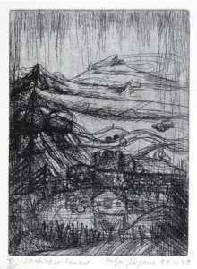
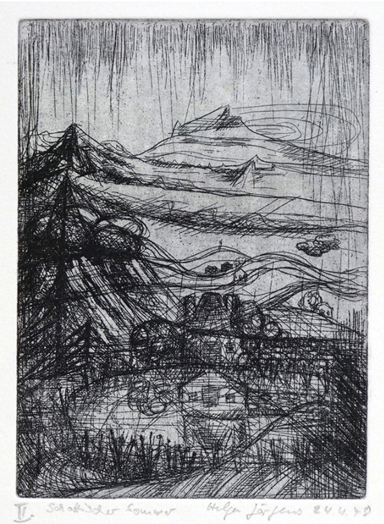
My first etching was Scottish Summer, 1978, containing all the typical ingredients I experienced on a summer holiday when travelling through Scotland: breathtaking mountain scenery, pine woods, baronial houses, crofts and lochs.
The technically more complex etching Roses harks back to my Surrealist pictures. Here, I combined the following different techniques: etching = covering the zinc etching plate with a resin, drawing with a special needle into the resin to expose the metal surface – don’t forget to cover the back of the plate with resin too! Then immersing the plate in an acid bath. The longer you immerse the plate, the darker and wider the lines will be. The next layer was aquatint in order to create shading and tonal shapes. You sprinkle fine resin dust on the clean surface of the plate and heat it so that the dust will adhere to the plate. After that, you cover the areas, which should remain white, with liquid resin and return it to the acid bath. You then cover the areas, which are of a light tone, with resin, etch the plate again and repeat until you have achieved the tonal scale you want. Lastly, the spiky climbing plant on the left was drawn by drypoint where you draw with your etching needle directly into the metal plate. As you need more force to overcome the resistance of the plate, drypoint lines often are straighter and may not appear as effortless as etched lines where you only draw into a soft layer of resin.
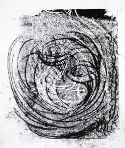
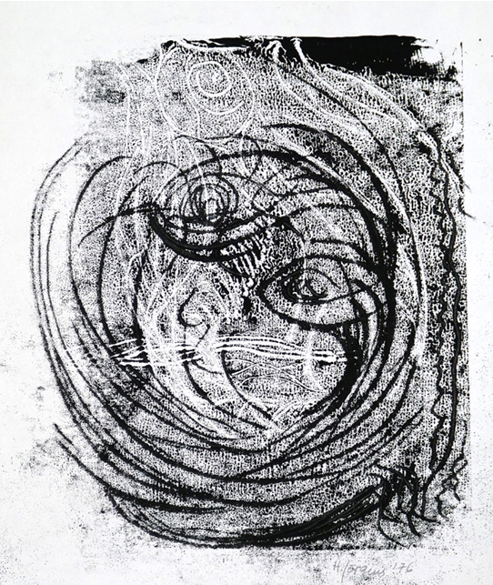
Another printing technique, I like and keep coming back to, is monoprinting. Above right, you see an example, Satisfied. By now familiar with oil-based etching ink, I rolled it out onto a flat surface, put the drawing paper loosely face down onto the ink, and drew the motif from behind. Invariably, the paper will stick in several places to the ink, and the lines will show slightly rough edges. I like working with chance, see what it throws at me and keep going with it, developing my pictures further. Here we see a smiling face, perhaps that of a cat?
Doctorate
My doctorate about the German sculptor, painter and printmaker Edwin Scharff (1887-1955) broadened my horizons concerning the world of sculpture in the first half of the 20th century. It also gave me an insight into Hitler’s and the Nazis’ devastating cultural policies and what it was like to live in Germany as a sculptor persecuted by the Nazis. Scharff was not only condemned as a so called ‘degenerate’ artist, but also, against all the odds, was able to protect his Jewish wife.
Work
Working at the Lehmbruck Museum – Centre of International Sculpture in Duisburg, near Düsseldorf, 1982 to 1984, was a very important experience for me. The art gallery is both dedicated to the work of the German Expressionist sculptor Wilhelm Lehmbruck (1881-1919) and also collects and exhibits international modern and contemporary sculpture.
Here, I delved into the world of sculpture of the 20th century. I worked in the areas of research and preparation of exhibitions as well as familiarising the public with the collection and special exhibitions through guided tours and workshops. I always enjoyed this part of my job.
I then worked at the Kunsthalle Bremen from 1985 to 1989, a prestigious art gallery which also houses one of the largest and finest collections of prints and drawings in Germany. Apart from my role, again in research, exhibition preparation and working with the public, I took the opportunity to view drawings and prints of great masters like Dürer, Goya, Degas and Picasso in the collection. I also regularly visited the studios of both the painting restorer and paper conservator at the museum in order to learn more about their concerns regarding the conservation and restoration of works of art. This interest inspired me later, when living in London, to study paper conservation and open my own studio.
Examples of my work in the 1980s
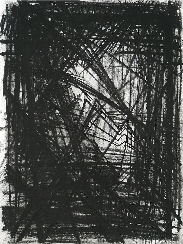
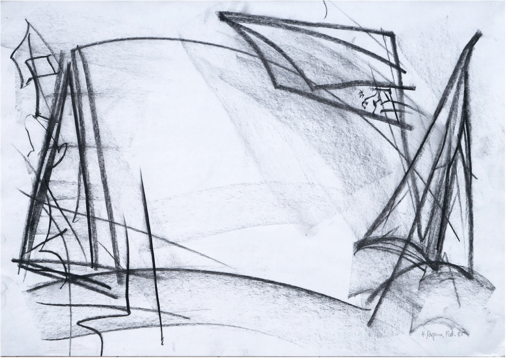
Structures, Charcoal on paper
In the early 1980s, I created a series of dark charcoal drawings which I called Black Pictures. One example is the drawing Structures. Dense scaffolding in dramatic perspectives create forbidding enclosed spaces. The series was inspired by Piranesi’s cycle of engravings, called Carceri d’invenzione (Imaginary Prisons) with their haunting spaces and strong light – dark effects. [https://en.wikipedia.org/wiki/Carceri_d%27invenzione]
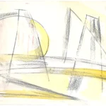
In contrast to the Black Pictures, in the drawing, Bridge, although I retained some architectural elements, I opened up the composition into a lighter, more airy space. I placed the drawn elements towards the edges of the picture leaving the middle empty, moving away from the focus of traditional art on the centre of a work. This is a compositional device that I keep returning to.
-
- Bridge, charcoal on paper
-
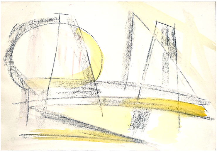
- Opposites, Charcoal and watercolour on paper
-
- Tower Bridge, Watercolour
I loved to combine minimal geometric forms with washes of watercolour in order to make the picture shimmer.
In the watercolour, Tower Bridge, I used minimal means of vertical and horizontal brush strokes to form an image which captures light shining onto Tower Bridge and the river Thames.
-

- Exuberance, watercolour on off-white etching paper
-
- Urban, Watercolour and charcoal on paper

The complex image, Urban, suggests man-made structures in the form of bridges, walkways and tall buildings synthesized into an urban landscape. The harsher forms and clear outlines were inspired by the latest art movement at the time, Neo-Expressionism.
-

- Birdies Series Oil Pastel
-
- Birdies Series Oil Pastel

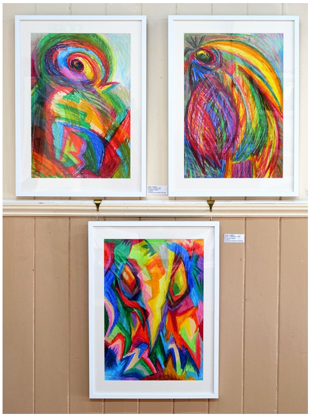
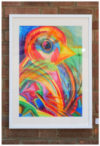
In 1988, I visited Walsrode World Bird Park, the world’s largest bird park, in North Germany. It motivated me to draw four large scale colourful bird portraits, which I called the Birdies Series. They are dressed in bright colours and are drawn in a caricature-like manner. The pictures are pure fun as is the title Birdies because only two, Robin and Finch fit that description whereas Toucan and Raptor are anything but little birdies!
MOVING FROM GERMANY TO LONDON MARKED A SIGNIFICANT TRANSITION IN YOUR CAREER. HOW DID THIS CHANGE IN ENVIRONMENT INFLUENCE YOUR ARTISTIC STYLE AND APPROACH?
Moving to London at the beginning of 1990 changed my life completely. I slowly felt my way into my new environment, renovating our flat and learning the language better, particularly how to understand the South London accent!
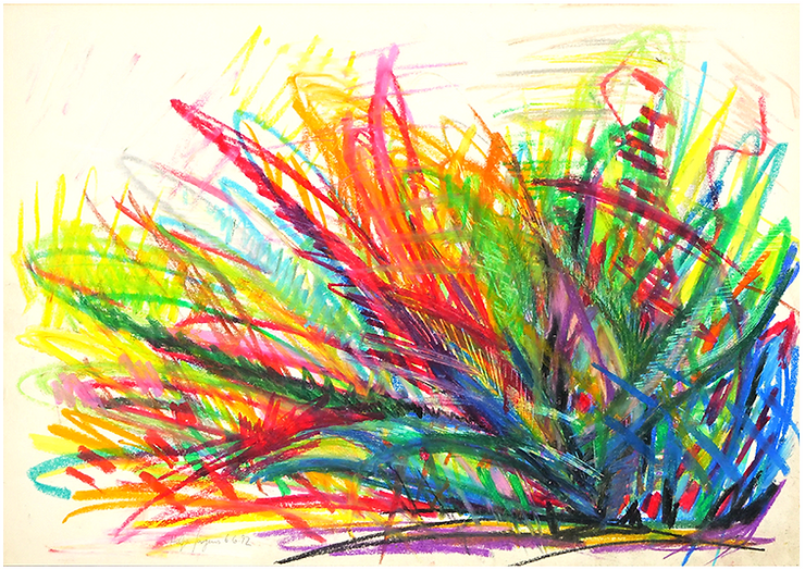
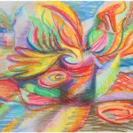
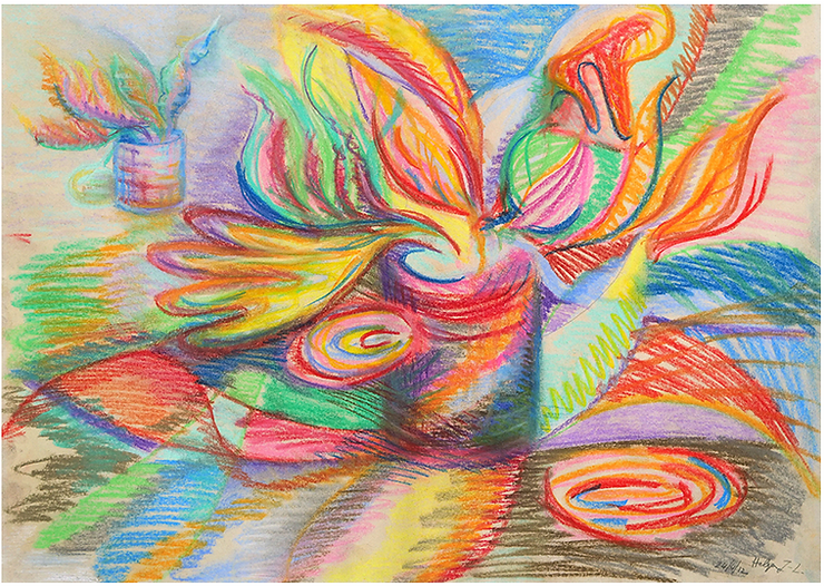
Exuberance (Plant), Oil pastel on paper
My oil pastel drawing Exuberance (Plant) expresses the joy of life, the feeling of growing and expanding I felt living in London where all the arts including music, theatre and ballet were suddenly at my fingertips.
In the following year I was ready to embark on my new career in teaching, first in an Adult Education College, while completing a teachers’ training course, then finding employment in Further and Higher Education teaching History of Art and Design or Contextual / Critical Studies to students who were training to become artists or designers. I began as a visiting lecturer until the end of the 1990s when I gained a permanent position at Southwark College.
Unfortunately, my teaching practice did not leave me much time to paint, and I had a creative break.
YOUR PASSION FOR TEACHING THE HISTORY OF ART AND DESIGN SHINES THROUGH. HOW HAS TEACHING IMPACTED YOUR OWN ARTISTIC PRACTICE, IF AT ALL?
In preparation for teaching my classes in Art and Design, over the time span of 19 years, I took over 1000 slides and later digital slides to show to my students as a basis for discussions in class. Videos of art programmes by the BBC and the National Gallery were also used as were the resources in the excellent art library of the college.
Why did I need so many images? I was teaching on a large variety of courses spanning from National Diplomas in General Art and Design, Multi Media Design to Audio-Visual Design (Film Studies), Foundation in Art and A-Level courses, Higher National Diplomas in Graphic Design, Textiles, Three-Dimensional Design (i.e. every-day items or furniture) to Jewellery Design for which I had to research the history of jewellery. I was also a visiting lecturer at the Inchbald School of Design – Interior and Garden Design in London giving lectures on the History of Interior Design. Every course had a different curriculum, and the content of my classes tied in with the students’ practical work.
However, you cannot learn about Art and Design only through resources in college. Therefore, an important part of the students’ learning was experiencing original works in the flesh, and London offers perfect opportunities. I regularly took out my students not only to the large national galleries of art, design and culture but also to smaller, more specialised venues, like the Estorick Collection showing Italian art, the Royal Institute of British Architects, the Fashion and Textile Museum, the Theatre Museum (closed in 2007) and a very interesting Japanese Manga exhibition.
I just loved sharing my enthusiasm about art with my students and, besides fulfilling the required curricula, endeavoured to teach them different ways of seeing and how to engage with, respond to and evaluate independently any art, design or film that they would encounter in their professional life.
After all, much inspiration for art and design not only stems from life experiences but also from art or design of either previous generations or other contemporary practitioners. Design practice can be inspired by art and, vice versa; art often is inspired by technological progress and design. What artists and designers have in common is the use of formal elements like colour, composition and materials as the means to fulfil the purpose of the work. The students learnt to identify how the message, meaning or purpose could be expressed and to analyse which artistic language was used to communicate it. Understanding this design process gave them the tools to be successfully creative in their own chosen field of expertise.
I also worked on the rewarding Housebound Learners Project at South Thames College. Unfortunately, the project closed after a few years due to lack of funding. I taught adult volunteers, who had been teamed up with a housebound adult each, for two hours, gave them specially prepared written teaching material like photographs of the artworks discussed in class, background information and questionnaires, in order to enable them to teach their housebound friend for an hour. Once a term, we visited a gallery relating to the course with the housebound students. There was also a yearly party in the college furthering our contacts. We all very much enjoyed our classes and gatherings. The housebound students very much appreciated the regular stimulating contact with the volunteers and learning about art.
Needless to say, I learnt so much myself through teaching which I consciously or unconsciously apply in my own art practice.
YOUR EXPERTISE SPANS NOT ONLY ART BUT ALSO PAPER CONSERVATION. HOW DO YOU FIND THE BALANCE BETWEEN THESE TWO DISCIPLINES IN YOUR CREATIVE PROCESS?
During the two years of studying Paper Conservation for a Master of Arts degree in Conservation at Camberwell School of Art (University of the Arts London), 2006 – 2008, I also worked half of the week in teaching. As the Conservation course was full time, I had no time at all for my own art; in fact, I had no time to do anything else, no private life at all. I could not have succeeded in Paper Conservation without the support of my husband, David. After gaining my MA degree, I opened my own conservation studio and worked for private clients while still teaching until 2010. With the end of my teaching career, I fully concentrated on paper conservation.
Eventually, my own art re-entered my life when I joined an evening class focused on painting still lifes from observation. I enjoyed the discipline of the weekly classes and the rigour of concentrating on scrutinising the objects in front of me and transforming them into pictures. During this process, the objects must fit the logic within a painting which is different from the logic of reality. Not only do you need to create a composition which is satisfying for the viewer’s eye, but you also have to understand the relationship between the formal elements within the composition to the overall effect of the picture. Painting from life is a transformation which follows its own rules.
-
- Still Life with Kettle, Acrylic, sand, leaves and twiglets on paper
-
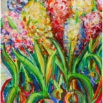
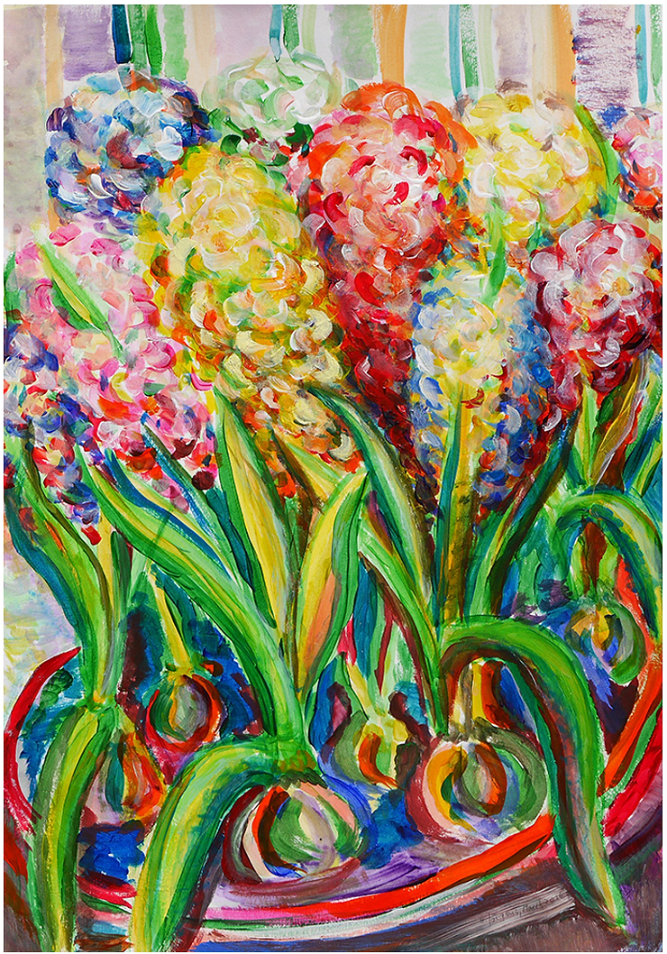
- Hyacinths, Acrylic on paper
-
- Hyacinths, Acrylic on paper
-
- Flowers in a Tin, soft pastel on paper
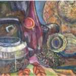
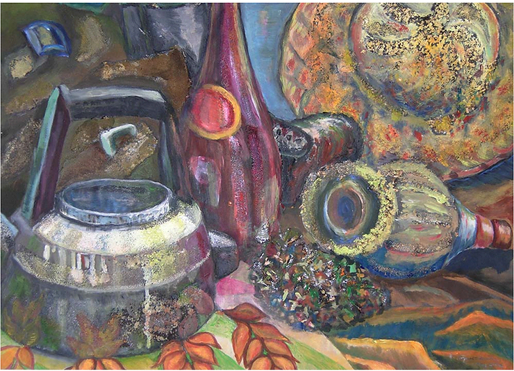
In Still Life with Kettle, I enhanced and enriched the textures of the objects by pasting sand, leaves and twiglets onto the surface before painting.
Hyacinths depicts a bowl tightly filled with different coloured hyacinths. I focused on using bright, contrasting colours, modelling forms and creating a variety of textures and patterns. I wanted to achieve a strong and expressive painting where colour is a dominant element.
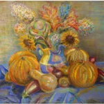
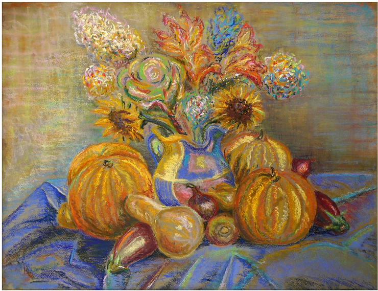
In Still Life with Pumpkins, I used soft pastels to achieve a detailed rendering of the forms and textures of the items depicted.
I developed the colourful abstract composition, Flowers in a Tin, from observing a bouquet of flowers in a food tin. I enjoyed the freedom of movement and the bright contrast of colours to create a sense of flow in the painting.
AS A PAPER CONSERVATOR, YOU’VE WORKED EXTENSIVELY ON PRESERVING AND RESTORING ARTWORKS. COULD YOU SHARE ANY MEMORABLE EXPERIENCES OR CHALLENGES YOU’VE ENCOUNTERED IN THIS FIELD?
Paper conservation taught me not only about paper and its characteristics but also about its ageing processes combined with the damaging effects of the environment – in particular light, ambient moisture and framing materials made from wood or wood pulp. Light will fade colours and darken paper. Moisture will contribute to the appearance of brown spots in paper made from wood pulp.
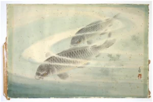
-
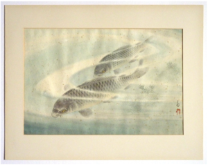
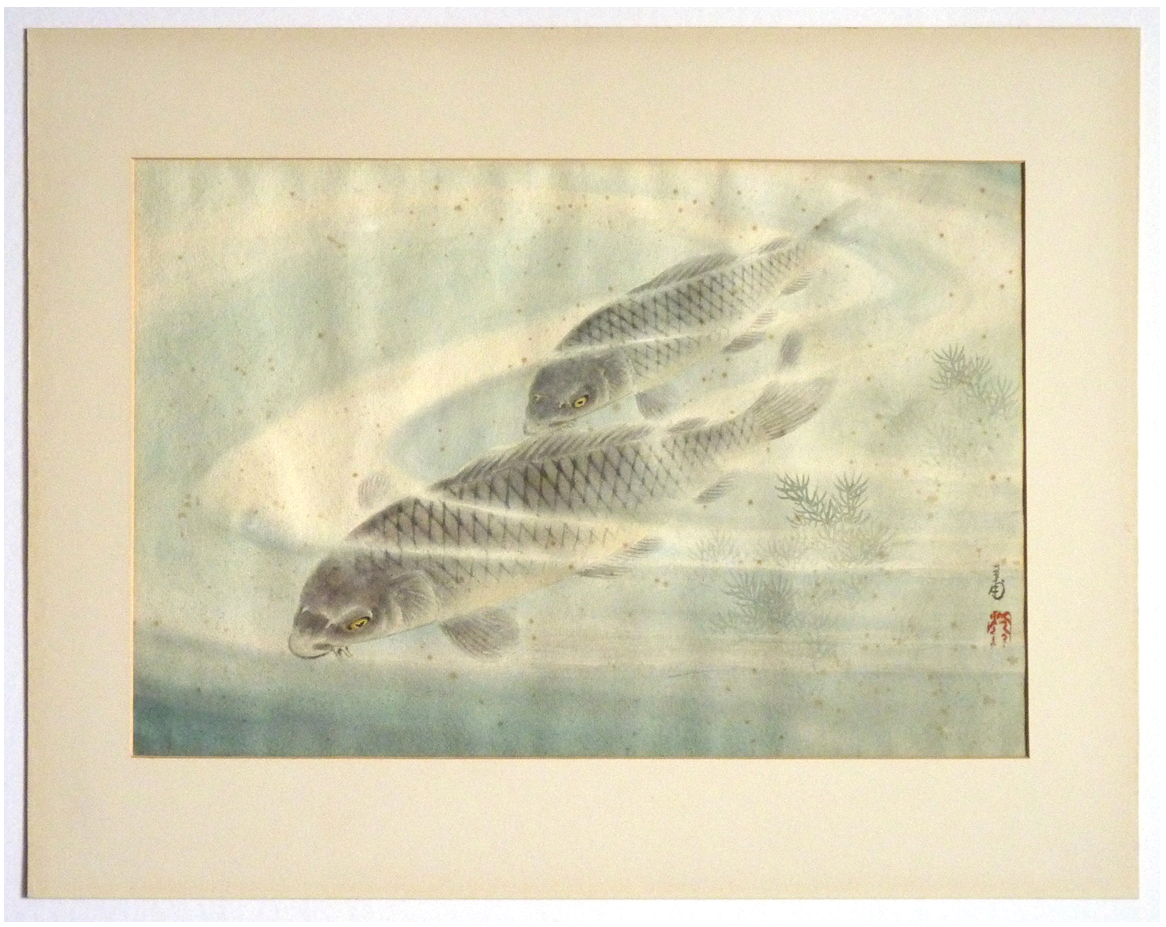
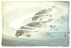
- Japanese picture of two swimming carp in its mount, before conservation treatment
-
- Japanese picture of Two Swimming Carp, out of its mount before conservation treatment
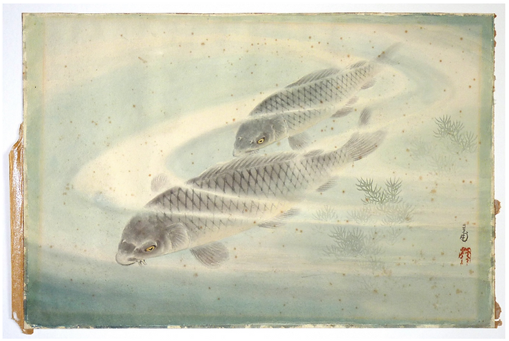
Here is a good example of such damage. The beautiful vintage Japanese watercolour painting of Two Swimming Carp had been framed in a window mount of wood pulp mountboard. Overall, it has yellowed with age, and the area of the bevel cut exposes the brown colour of the deteriorated wood pulp. When paper ages and deteriorates, it becomes more acidic. This happens particularly strongly in paper made from wooden fibres. Paper made from cotton, rice or mulberry deteriorates far less and remains more stable.
The Carp picture must have become moist due to the cockling, particularly along the upper edge and the overall brown spots which are called foxing due to its colour. Moisture speeds up the deterioration of paper.
-
- Detail of the top left corner

-

- Detail after the treatment
The photo of the detail of the top left corner before treatment shows that the paint which was situated under the mount is darker than the area which was exposed to light because the light had bleached it out. Although the work was framed behind glass, ordinary glass gives only a poor protection against the power of the UV light inherent in daylight. The brown line you can see running along the left edge and below the top edge of the paper was caused by the brown colour that seeped from the bevel edge of the mount into the painting. The little spots of ‘foxing’ stem from a backing board made from wood pulp because particularly under the influence of moisture, the brown colour migrated from the backing board into the artwork.
The work was treated with aqueous light bleaching which removed the brown staining and relaxed the paper so that the cockling disappeared too. I had researched this method for my MA thesis. In a nutshell: aqueous light bleaching means immersing the artwork in alkaline water and shining UV light onto it. This is a highly specialised treatment and should only be carried out by experts in the field.
-
- Japanese picture of two swimming carp, after conservation treatment

-
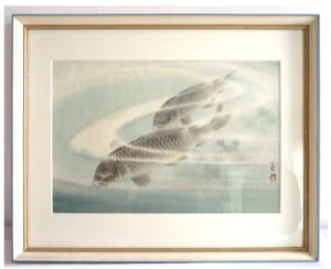
- The picture after treatment and newly mounted in its frame
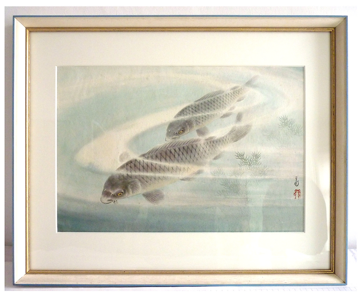
After conservation treatment, the picture appears brighter, cleaner and flatter. In the photo, showing the work framed, the image appears darker than the unframed one due to the type of glass I used in the frame.
As I had completed a framing course in 2006, I offered my clients not only conservation treatments for their artworks but conservation framing too.
HOW DID MY EXPERIENCES AS A PAPER CONSERVATOR AFFECT MY OWN WORK?
My experience as a paper conservator led me to use only conservation grade materials, like for framing, 100% cotton mountboard, Japanese rice paper hinges to fix the artwork to a backing board and 99% UV-protective acrylic glass, and instead of wood-based MDF backing boards, a special conservation grade cardboard for the framing of my works on paper.
Concerning my creative process, I only use artist quality colours and paints and wood-free papers. These paints have the most brilliant and saturated hues and lightfastness, and good quality paper adds to the beauty of the works and contributes to my joy when painting.
Moreover, I like to give my customers the best quality product which they can enjoy for years to come.
YOUR APPROACH TO CREATING ART, PARTICULARLY ALLOWING THE IMAGE TO EVOLVE DURING THE PAINTING PROCESS, IS INTRIGUING. COULD YOU WALK US THROUGH YOUR CREATIVE PROCESS AND HOW IT HAS EVOLVED OVER THE YEARS?
My Surrealist paintings were meticulously prepared with studies of individual pictorial elements and a full-scale outline drawing of the whole scene. This was copied onto semi-transparent grease-proof paper – sandwich bags which I cut open and glued together to the required size. Carbon paper was then placed on the primed substrate and the image was copied by redrawing the lines found on the grease-proof paper. As oil paint dries so slowly, I found it necessary to indicate precisely where each colour should go in order to keep them clear.
My abstract pictures are not prepared by drawings because it would stop the spontaneity of painting. Some images are more dramatic, others are quieter. This is a decision which I make early in the painting process. The choice of what kind of marks or shapes to make follows.
Once I start putting down marks or lines, I begin to set out a composition on the page. From there, I add colour and build the painting up. There is a close dialogue between what appears on the surface and my eye. It is as if the painting tells me which colours or forms to use next. As the work develops, more scope for details emerge which will be put in towards the end of the process.
Blue Lake, Monoprint with etching ink, soft pastel and wash on cream Ingres paper
The inspiration for my picture Blue Lake was the beautiful and serene song The Blue Bird composed by Charles Villiers Stanford in 1910. The song evokes the image of a blue bird flying above a very calm, blue lake.
[https://www.youtube.com/watch?v=nE0JRx3CHv8] However, my picture is not an illustration of the song. Instead, it expresses the feeling I had when singing it as part of Hunstanton Community Choir, Hunstanton, Norfolk, under Simon Bower before the Covid lockdown.
In Blue Lake, I decided on the composition when drawing the black lines from behind as a monoprint. I then added the colours with soft pastel, going over with a brush and water to merge some areas in order to achieve more transparent and harmonious water-like effects.
Painting and correcting a watercolour
Although I normally don’t have any preconceived idea as such when starting out, there are decisions made before painting. Firstly, I pick the medium to use. The chosen material determines the design process and the outcome. For example, using watercolour you have to work in a different manner from painting in acrylic. You can thin acrylic paint down to a watercolour-like transparency and create similar effects but, whereas acrylic paint cannot be changed once it is dry, you can activate watercolour once it has dried. The closer to the original painting process you are, the easier it is to re-wet the watercolour paint, the better you can re-model the area. With the passing years, watercolour can become more permanent and after about 70 years it may even be permanent.
-
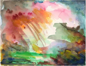
- Shower, final version, watercolour on watercolour paper

-
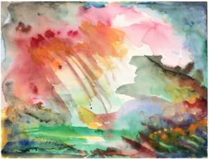
- Shower, earlier version

In the painting, Shower (above), I started by wetting the paper and then dropping paint into particular areas in order to let the colours merge. They always look darker while painting. So, you need to let the picture dry to see the effect you have created. With experience, you get a feel for what to expect in the painting process. Either while still wet or after re-wetting an area later on with a brush, I often dab some paint off with kitchen paper which has a good ‘wet strength’. By taking paint off, the area becomes lighter and more transparent. New layers of paint are then added, partly dabbed off and so on until I am content with the result.
It sometimes happens that there remains an area, even if it is a small corner, that stays unresolved. I then let the picture rest, put it away and return to it at a later time. Sometimes, it takes years until I find the solution of how to finish the work.
For example, above, you see an earlier version of ‘Shower’. The difference lies in the area at the bottom right-hand corner. In this version, there are too many small details like narrow green lines and yellow dots. This small scale does not match the boldness of the larger shapes and lines of the rest of the picture. I had to dab out most of the yellow dots and soften the orange area, let the picture dry and paint over it. I needed patience and several attempts to reach the end result.
Yes, patience is needed when creating art; patience with the medium (waiting for paint to dry) but also patience with yourself. Don’t get angry about your mistakes because they can be remedied, even after years if needed. I learnt patience and not to panic if things go wrong in paper conservation because paper can sometimes react in unexpected ways. You need to be prepared to re-do steps and stay flexible in your approach. There is No Way that you give up because you have to see the treatment through to the end. You need to find a solution as you can’t leave a picture half repaired.
A question, I am asked repeatedly, is, “How do you know when a picture is finished?” The answer is that it is finished when I think that the composition is well balanced, and all its elements come together in harmony. Another criterion is that I can’t add anything else to it without changing its nature … and when I feel happy with the work … and when I enjoy looking at it without thinking that an area needs to be changed in any way. One just knows when this stage is reached.
INSPIRATION FROM NATURE: YOUR RECENT WORKS, ESPECIALLY DURING THE COVID-19 RESTRICTIONS, DEPICT IMAGINED LANDSCAPES INSPIRED BY NATURE. HOW DOES NATURE INFLUENCE YOUR ART, AND WHAT ROLE DOES IT PLAY IN YOUR CREATIVE EXPLORATION?
I grew up in a house at the edge of the town of Jever in north-west Germany with a view on pastures with cows, sheep and horses. As a child, I went horse riding in a riding club where the horses were kept in an agricultural hall in town during the winter but during the summer lived on the owner’s farm, three miles away. I enjoyed cycling there with my friends along a beautiful country lane, bringing the horses in from the pasture, cleaning, saddling and riding them. Particularly hacking out through the adjoining woodland and fields, brought me closer to nature. Also memorable were the sleigh rides on a large horse drawn sleigh with the riding instructor driving, and we children sitting behind him on the sleigh.
Meeting my husband, David, also brought me closer to nature because he is a keen bird watcher who never loses his patience showing and identifying the birds for me. I love going out observing these amazing creatures, either nearby, high up in trees or in their acrobatic and individual flight.
Since moving to Ringstead, near Hunstanton, Norfolk, UK, I have the good fortune to live in a house with a garden at the edge of the village. It meant that during the Covid lockdown, we could go for walks at the end of daylight when the paths were deserted and there was no danger that we would meet anybody. I also spent a lot of time watching the birds in our garden, mainly the Ducks and Moorhens with their struggles to raise their families, around our little pond. I regard the creatures in the garden as our ‘neighbours’, co-owners of it, who have a right to live there and need our protection. What fascinates me most is the resilience of nature, how it always manages to survive whatever the weather might throw at it.
SYMBOLISM IN ART: YOUR PIECES OFTEN FEATURE CONTRASTING ELEMENTS LIKE LIGHT AND DARKNESS. CAN YOU ELABORATE ON THE SYMBOLISM BEHIND THESE CONTRASTS AND HOW THEY REFLECT YOUR PERSONAL EXPERIENCES OR WORLDVIEW?
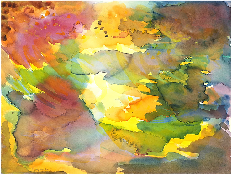
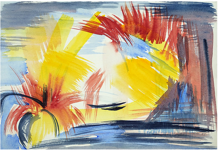
Sunburst, Watercolour on watercolour paper
Perhaps most people experience times of darkness, or despair, in their lives. Bereavements, or being bullied could cause such darkness. I went into that but, with help, came out ‘on the other side’ as a stronger ‘me’. What I learnt in the process, was not to despair but to trust myself that I can get out of such a situation. This led to a strengthening feeling of hope as well as thankfulness. Every now and then, I just stop and count a few blessings in my life I am thankful for. Immediately, the world becomes bright and I feel happy. Having said that, the feeling of hope, the light at the end of the tunnel or the silver lining on the rain clouds, has always been present in almost all my art right from the beginning.
You can see this in my watercolour, Sunburst, 2023. Bright sunlight shines through dark clouds illuminating the whole scene.
YOUR INVOLVEMENT IN GROUP EXHIBITIONS AND ART ASSOCIATIONS IN WEST NORFOLK HIGHLIGHTS YOUR COMMITMENT TO THE LOCAL ART COMMUNITY. HOW HAS BEING PART OF THESE COMMUNITIES ENRICHED YOUR ARTISTIC JOURNEY?
Being a member of the West Norfolk Artists’ Association (WNAA) and taking part in group exhibitions with them and in the West Acre Gallery, West Acre, Norfolk, is a very enjoyable experience because my fellow artists as well as Abbey Stirling, who runs the West Acre Gallery and is an artist herself, are friendly, welcoming and support each other. There are regular members meetings of the WNAA, often at exhibition openings of shows by members, where we view one another’s artworks and exchange ideas. Exhibiting together three times a year with a large summer exhibition in King’s Lynn is always uplifting and interesting. Coming out of the loneliness of our studios, it is refreshing for all of us to share our art. You also see your work in the framework with that of other artists and find out where you are standing. The contact gives you the stimulus to carry on and perhaps try out new ideas. While monitoring the exhibition, you also talk to the visitors, explain your art and open their hearts to new experiences. They normally leave the exhibition happy and enriched.
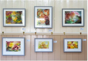
YOUR SOLO EXHIBITION AT RINGSTEAD VILLAGE HALL PROVIDED A PLATFORM FOR ART ENTHUSIASTS TO IMMERSE THEMSELVES IN YOUR WORLD. WHAT MESSAGES OR THEMES DID YOU AIM TO CONVEY THROUGH THIS EXHIBITION?
It was great to have the opportunity for a solo exhibition because I could show 30 works which reflected many of my current artistic interests and their development. Most of these works had been inspired by nature but there were also more abstract compositions from my imagination. Visitors were particularly interested in the media and techniques like monoprinting and how I had made them. Everybody found something which they liked.
THE PANDEMIC POSED UNPRECEDENTED CHALLENGES FOR ARTISTS WORLDWIDE. HOW DID YOU NAVIGATE THESE CHALLENGES CREATIVELY, AND DID THEY INFLUENCE YOUR ARTISTIC DIRECTION IN ANY WAY?
Impromptu, 2021, Acrylic gouache on grey board
Firstly, I am very lucky to be married to a fellow artist who shares similar artistic endeavours to me. That was very helpful for both of us. Secondly, artists were reaching out to each other. The WNAA organised online exhibitions and art challenges by setting topics to inspire the creation of art which was then exhibited online. I took part in the one on Music, and submitted the picture Impromptu which you can see below. I chose acrylic gouache because it is more fluid than traditional acrylic paint and has very vibrant colours. The landscape was inspired by Franz Schubert’s piano piece: Impromptu Opus 90, No. 3 G-flat major.
Exhibition of Women’s Lockdown Art
I was also invited to take part in the online exhibition Women + Health: Women’s Lockdown Art, Online Fundraising Exhibition for Women + Health, London, in November/December 2020. These are the three postcard size pictures I exhibited and sold for the project:
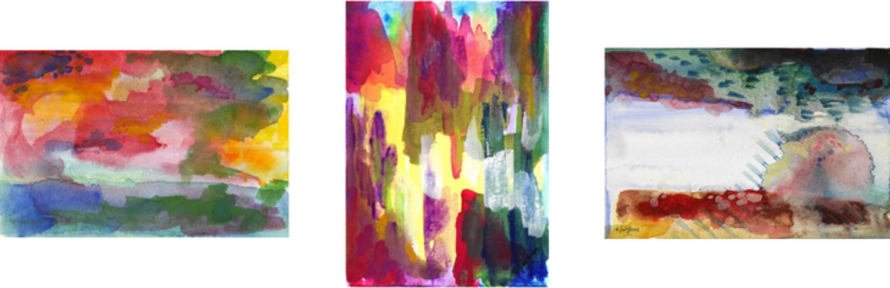
Left image: Landscape, Acrylic gouache, Middle image: Cave, Acrylic gouache, Right image: Rock, Acrylic gouache
YOUR INVOLVEMENT IN NORFOLK OPEN STUDIOS SHOWCASES YOUR COMMITMENT TO ENGAGING WITH THE PUBLIC. HOW DO YOU PERCEIVE THE ROLE OF OPEN STUDIOS IN CONNECTING ARTISTS WITH THEIR AUDIENCE?
-
- Norfolk Open Studios, Ringstead Village Hall 2023

-

- Norfolk Open Studios, Ringstead Village Hall 2023
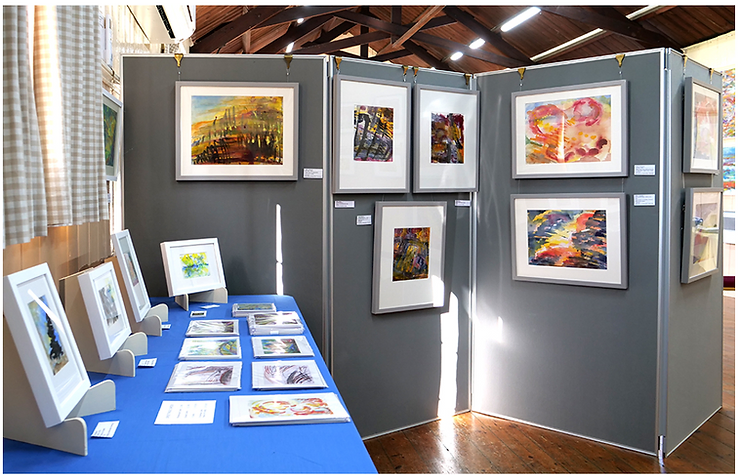
Norfolk Open Studios is an important showcase for us artists. The event is prepared by the organisation Norfolk Open Studios (run by Norfolk and Norwich Festival) with preview exhibitions, both smaller regional exhibitions showing work of the artists of the area and one large central exhibition at the Forum in Norwich. A free brochure and website publish all artists and studios in advance.
I have been taking part in it since 2017. During two weeks of the year artists open their studios to visitors or, as in our case, a small group of Ringstead artists come together in an exhibition at Ringstead Village Hall. This has been very successful with visitor numbers in their hundreds because they enjoyed seeing the art of several makers in one place. For the last two years, Jane Brun, Barbara King, David Lendrum and I exhibited together. Last year, we formed the group of Wild Form Artists (Instagram: wildformartists) because, although our art differs very much from each other, what we have in common is the love of nature.
It is good to see one’s art in a different environment, experience how it holds its place on large walls and in direct contact with the art of the other members of the group.
Open Studios connects artists with each other but also with the public. During the exhibition, we treat the village hall as our studio and paint there demonstrating our art practice. We are present and available to our visitors during the opening hours. We meet other artists and exchange our experiences but also enjoy engaging with the general public in interesting conversations, explaining our art and our artistic approaches and listening to their reactions and comments about our work.
The first time I took part in an exhibition, I was nervous because I felt that my art exposes my inner soul, and that it was really me on display. I heard a similar sentiment from a poet after he published his first book of poems. Nowadays, I find it interesting to experience that, once a work is on public display, it takes on a life of its own and leaves me when it is sold.
YOUR WEBSITE SERVES AS A VIRTUAL GALLERY, OFFERING A GLIMPSE INTO YOUR ARTISTIC JOURNEY. HOW DO YOU LEVERAGE ONLINE PLATFORMS TO CONNECT WITH YOUR AUDIENCE AND SHARE YOUR ART?
With time, I plan to put more and more pictures on my website in order to build up a catalogue raisonné of my work. Sharing artworks on Instagram, it is interesting for all of us to see which pictures seem to resonate with our audience and what kind of comments we receive. This feedback is important to recognise which works are more successful than others. I also communicate with very interesting people and keep in contact with friends living far afield.
LOOKING AHEAD, WHAT ARE YOUR ASPIRATIONS AND GOALS AS AN ARTIST? ARE THERE ANY UPCOMING PROJECTS OR COLLABORATIONS THAT YOU’RE PARTICULARLY EXCITED ABOUT?
Having mainly worked on paper for a long time, I plan to paint larger pictures on canvas in acrylics and go back to using oil paint.
In the autumn of 2022, I started making sculptures in a workshop with the sculptor Esther Boehm in her studio in Heacham, Norfolk, which I very much enjoy. I am intrigued to see where it will take me.
Concerning collaborations, the Wild Form Artists group of last year still exists and we meet regularly. As there will not be a Norfolk Open Studios event this year, we plan to exhibit again in 2025.
The West Norfolk Artists’ association will move into a large exhibition space in the heart of King’s Lynn later this year which will offer interesting opportunities for exhibitions.
I am very excited about the plan for a series of YouTube videos and podcasts to be created this year with Hinton Media.
As we conclude our immersive exploration into the artistic universe of Helga Joergens, her revelations have illuminated the depths of creativity and ingenuity that define her work. From her early experiments with oil paints to the profound influence of her academic studies in art history and literature, Joergens’ journey is a testament to the transformative power of artistic expression. To continue experiencing the wonder of Helga Joergens’ artistry, visit her website at helgajoergens.co.uk and immerse yourself in a world where the extraordinary becomes reality.
This interview appeared in Your Cultural Dose (https://www.yourculturaldose.com/post/helga-joergens). Printed with kind permission from Hinton Media (https://www.hinton-media.com)