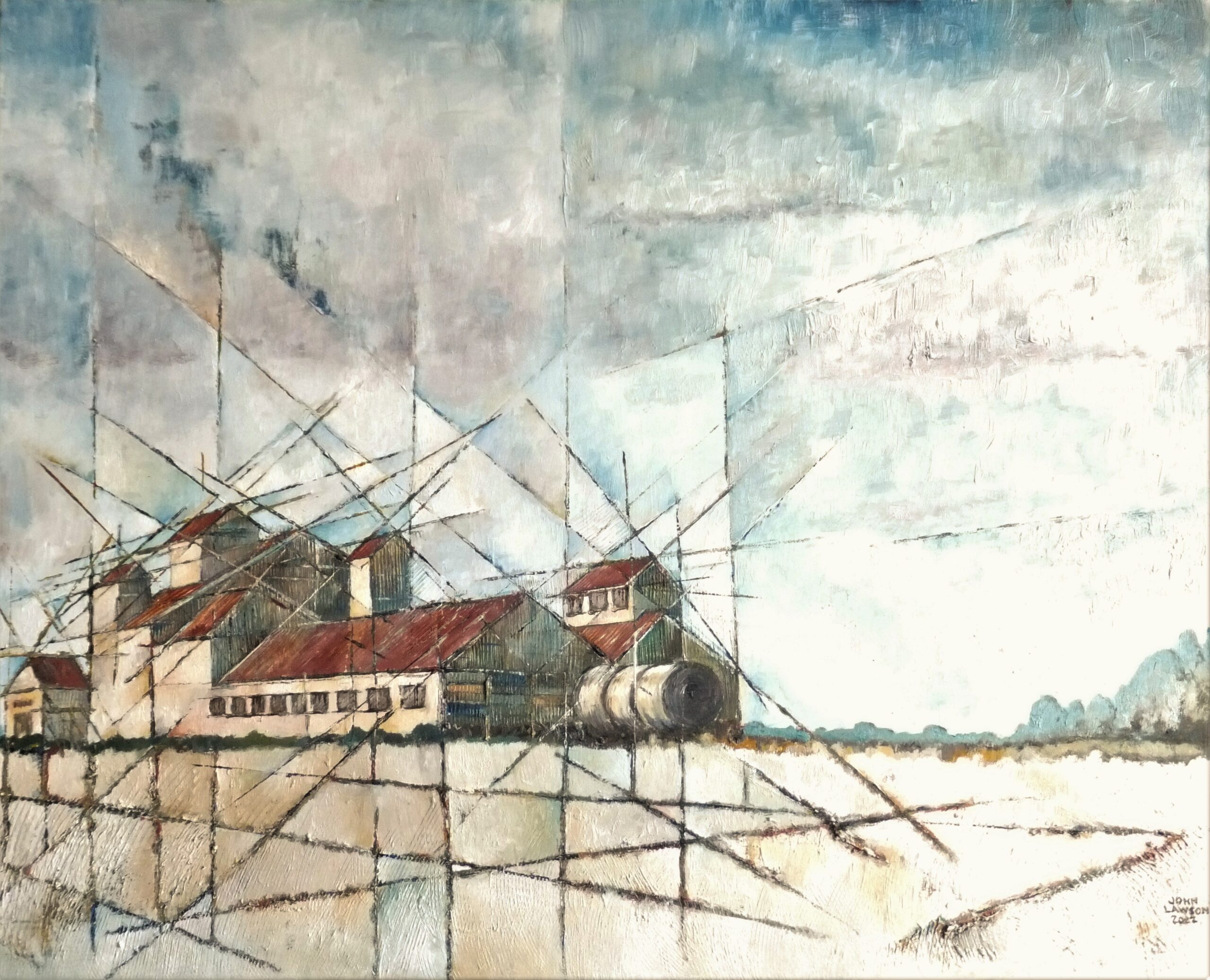
Granary No.4
I have been a member of West Norfolk Artists Association since 2005. At the time I was taking part in a series of Sunday Workshop sessions at King’s Lynn Arts Centre (The Fermoy). A number of other artists on the course were already members of WNAA and encouraged me to join. I’m so glad they did…
I have always had an interest in Art; from a very early age I was happiest when I was drawing. At school, Art was always my favourite subject. At fifteen, when the inevitable chat about my future with the Headmaster, the Careers Advisor and my Mum came about, I was adamant that I wanted to go to Art School. But this was 1967 and attitudes towards Art Schools were not what they are today. I was strongly discouraged from attending one of these dens of iniquity and settled for an O Level course at the local College of Further Education. I did however attend an evening class at my local College of Art & Design in order to take my Art A Level.
After getting the required number of O Levels (and my Art A Level) I undertook a student apprenticeship in engineering and subsequently became a draughtsman. In my early twenties the pull of Art was stronger than ever and I decided that, as much as I enjoyed being a draughtsman and earning very good money, a change of career was needed. So… to cut a long story short, I spent three years at Teacher Training College and a year doing a degree with Art as my main subject in both cases. For the next twenty years I was totally immersed in Art Education.
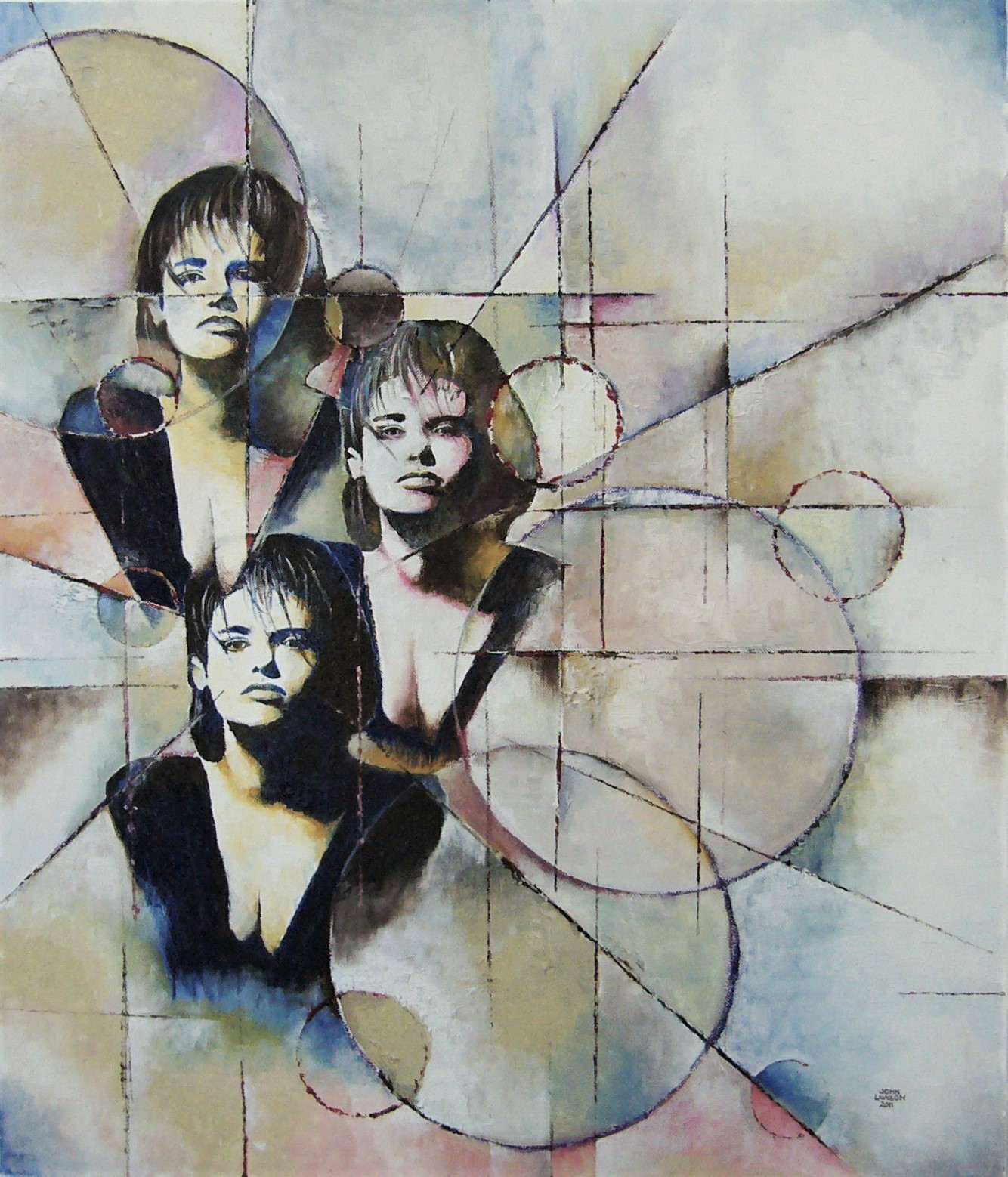
Betty Blue
It was during my time at college that my interest in painting developed exponentially. This was due to the fact that I had an excellent lecturer who gave me endless encouragement. His approach was, in the main, one of prompting and guidance rather than the teaching of techniques. Sometimes he would allow his students to struggle with a painting for a number of hours before pointing out something quite minor, but colossal in terms of guiding the painting towards a successful conclusion. There were a couple of things that he said which have remained with me that I still hold true in my approach. Firstly, on one of those many occasions (which I’m sure happens to all of us) when we have to decide if a painting is finished, I pointed out a certain feature of the painting that I was unsure of. My lecturer pointed out that it had a nerve to be there and, as such, it deserved its place in the painting. Secondly, after my doubts about the amount of white I was using, he emphatically stated that you could never have too much white!
The close proximity of the college to London meant that our ‘field trips’ often involved days in the capital at various galleries with talks and guided tours. These were a revelation; Monet, Degas and Cezanne in the Courtauld Institute and Braque, Picasso and Mondrian in The Tate made such an impression on me that spare days in the holidays were spent visiting as many galleries as possible – even discovering some of the exciting things that were happening at some of the smaller galleries such as The Serpentine.
From early on I was aware that the limited palettes of Braque and Picasso’s Cubist work and Mondrian’s Grey Tree were having a great influence on my approach. It was also evident in these paintings that surface texture was a great part of their appeal. I was already using oils before I started college but now I was fully aware of the potential of this particular medium. For many years, and to a certain extent, it’s still true today, my palette consisted of Cobalt Blue, Van Dyke Brown, Yellow Ochre and Titanium White. I hardly ever use black; the small tube of Lamp Black which I bought back in 1973 is still forlornly laying unloved in the bottom of my art box. Also, I have never used ready-made green; of all the shades and tints available, none have the same appeal as the subtle tones created by mixing Cobalt Blue (or Prussian Blue), Yellow Ochre and Titanium White. There are, of course, other colours that I use now but these tend to be within the ranges of Umbers and Ochres. As for primary colours, I find myself using red as a complimentary colour to create a contrast against some of the softer grey/green neutrals in my abstract work. Even when taking a figurative approach, many of my paintings still tend to have abstract elements (see photos). These may be landscapes, people, buildings etc. but essentially they are a vehicle for creating something via the very basic action of putting paint on a surface. Further influences in this regard have included such artists as Francis Bacon, Ken Howard, Lucien Freud and Colin Davidson – all masters of the art of transmitting the haptic essence of a textured surface.
Studio
People often ask me where I get my ideas from for my abstract compositions. There is no clear answer to this question but basically it’s usually one of two approaches. Firstly, simply making a mark on a blank canvas and reacting to it. This could be in a variety of ways; responding to the shape, colour, position or size of the ‘mark’ that you have made. It becomes a series of reactions as each stage you have something new to react to. Secondly, I often have a simple composition of shapes in mind, often geometric but sometimes more free-form. It’s amazing that in almost every case, the finished painting bears no resemblance to the original composition as again, it’s a process of action and reaction. It’s all very organic.
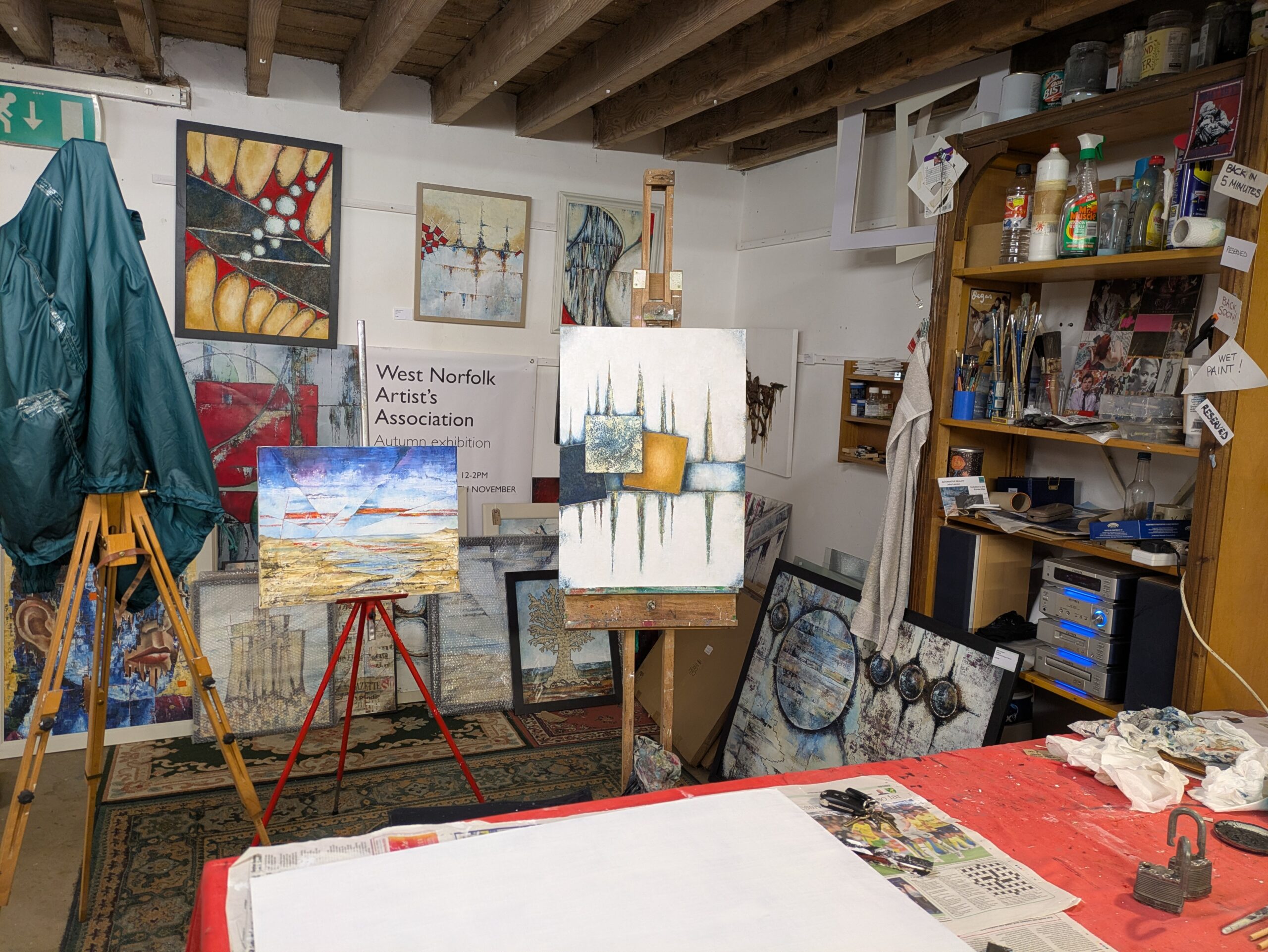
During the past ten years I have been lucky enough to share a studio in Walsingham which enabled me to work on large-scale projects and commissions. Having so much space gave me a great deal of freedom to work on more than one piece at a time (see photos). Unfortunately, due to unavoidable circumstances, I have had to move out of the studio and am now in the process of searching for somewhere new. If any members know of anywhere, please let me know. I am willing to share. Whatever happens, I will continue to enjoy the challenge of turning my ideas into visual expression.
John Lawson