 New Year’s Day 2020 feels like a lifetime ago now. I’m certain we all had plans, big plans, small plans, for the year – for me there were exhibitions, craft fairs, teaching, workshops and shows, with something booked all the way through from the beginning of March till Christmas. I was excited. This was going to be my busiest year ever. I worried whether I would have enough work, frames and mounts, worried about whether tools and lino would arrive in time for the classes. I was worried it might all go well; I was worried it might all go badly –
March arrived and setting up the first exhibition at Welney Wetland Trust was really good fun – it looked great and it felt like a lovely way to start the run of events. Corona Virus was on the way and I suppose there was a part of me assumed it would come and go and life would be much the same afterwards. It sounds so naïve now.
One day I had a full calendar, a week later nothing – email after email came in to cancel all those carefully scheduled events, and with every media outlet talking about rising hospital admissions and so many people dying – although it hurt, my art seemed trivial by comparison
I know lots of artists were inspired by the time in lockdown. I wasn’t – I was sad about my scuppered plans, unable to feel creative, and trying to manage a mother in care on end of life care, and an aging father who refused to stay in and was incredulous and annoyed when I pointed out he was high risk – the conflicting advice, the rising figures – I am sure we have all felt the stress and confusion of it.
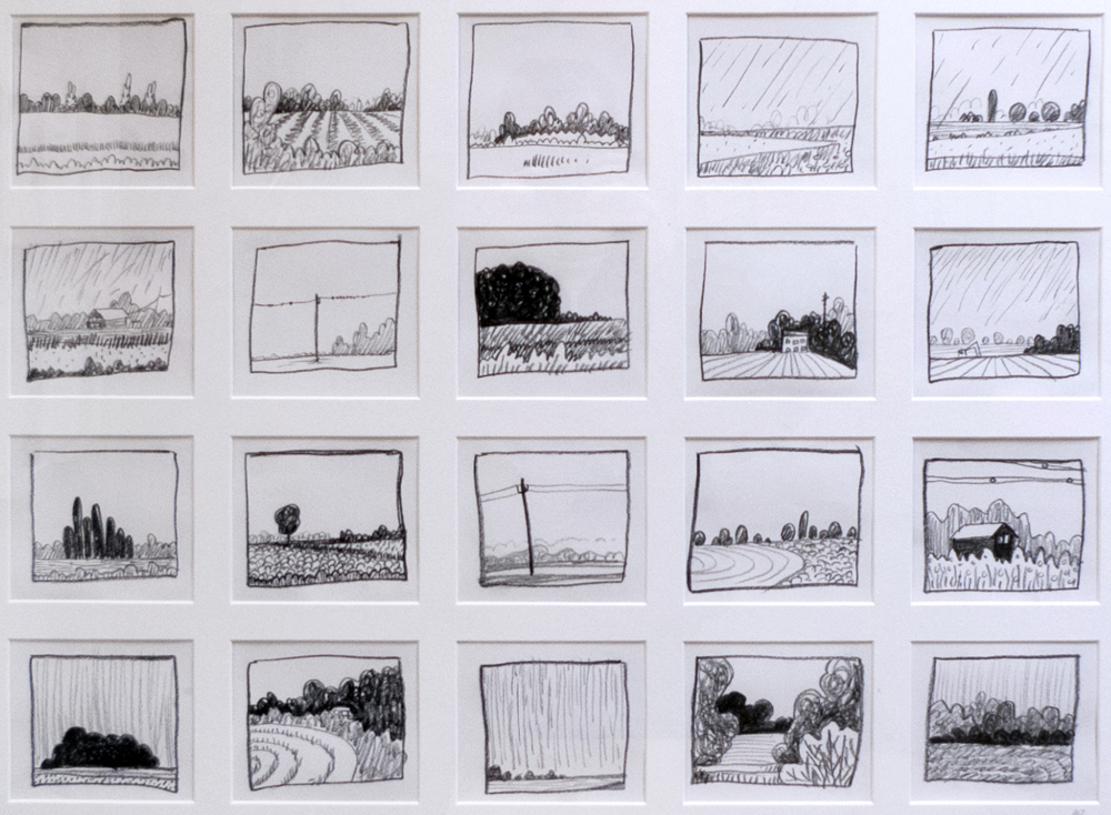
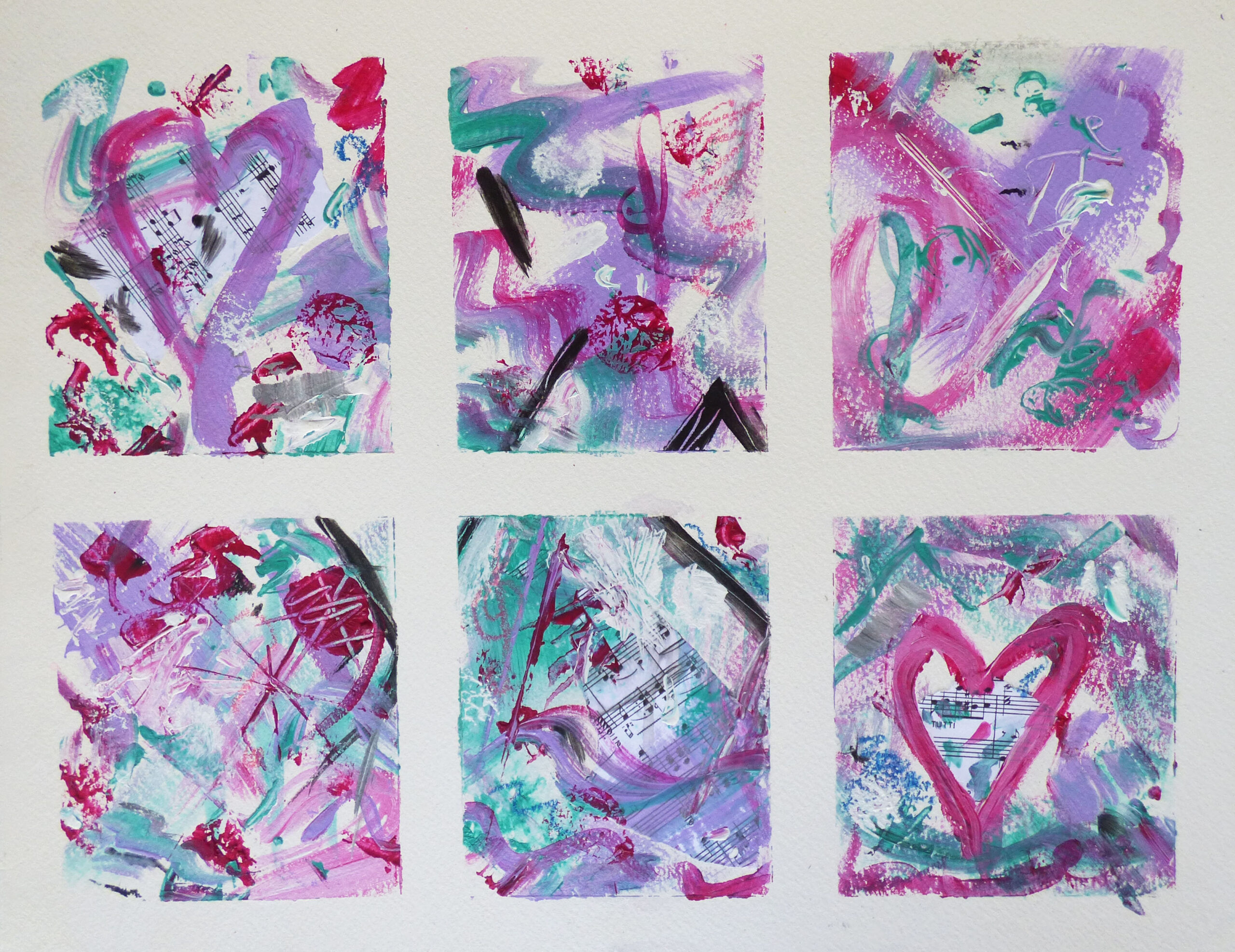
Eventually I began to make new work, mostly of things I was missing, like walking on the beach. But what I have missed most is interacting with the people I love, enjoy, like and admire – the village that is the art and craft community – catching up with people you may have not seen since last year, setting up your stand or helping to invigilate or hang a show, the shared joys of selling or not, of swapping hints and tips and contact details of people who supply that wonderful thing, that perfect tool or run that wonderful fair.
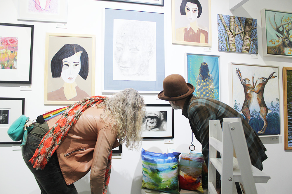
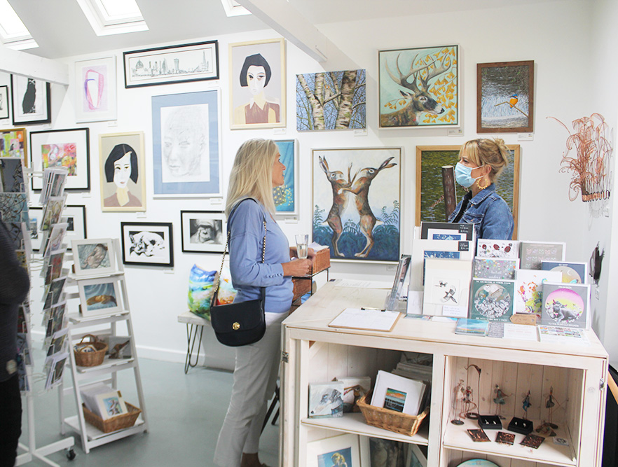
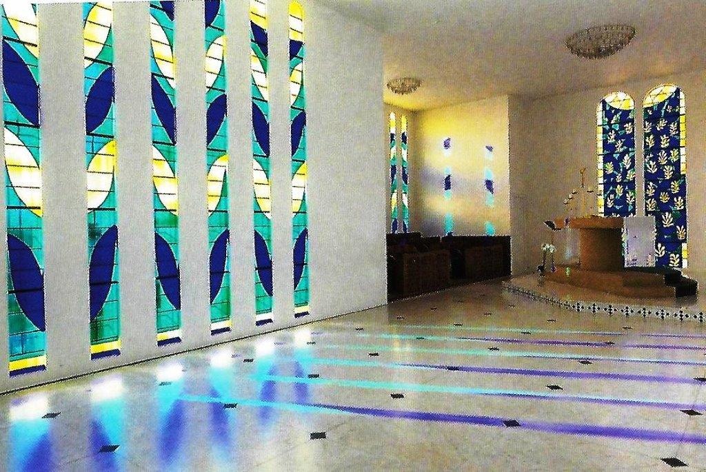
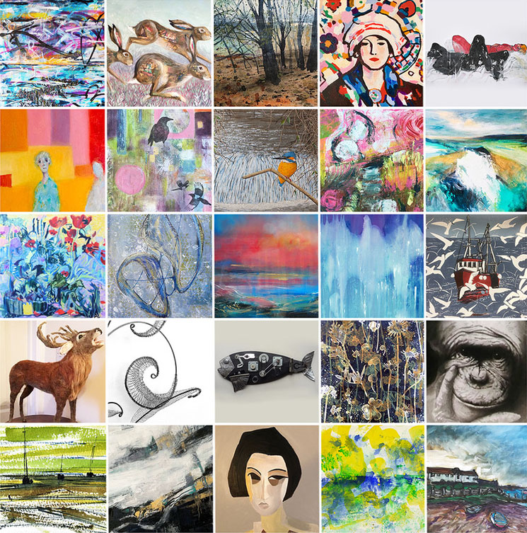
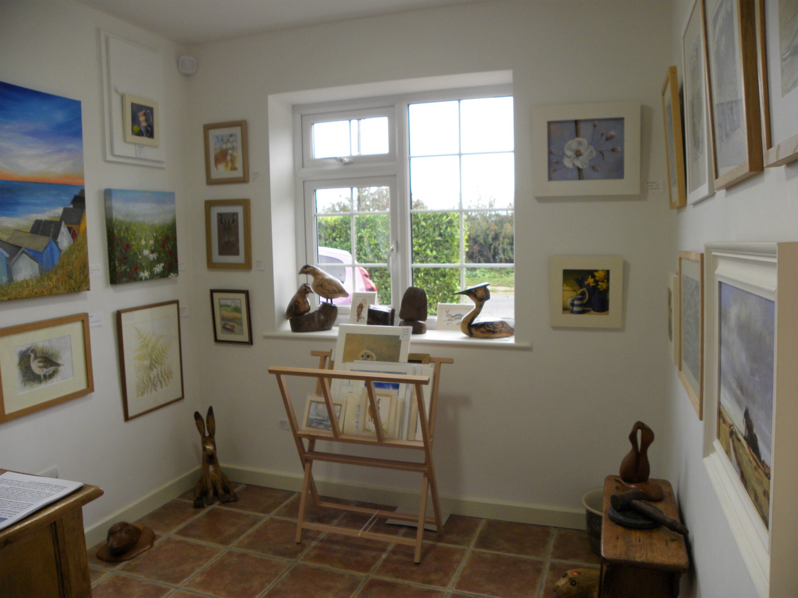
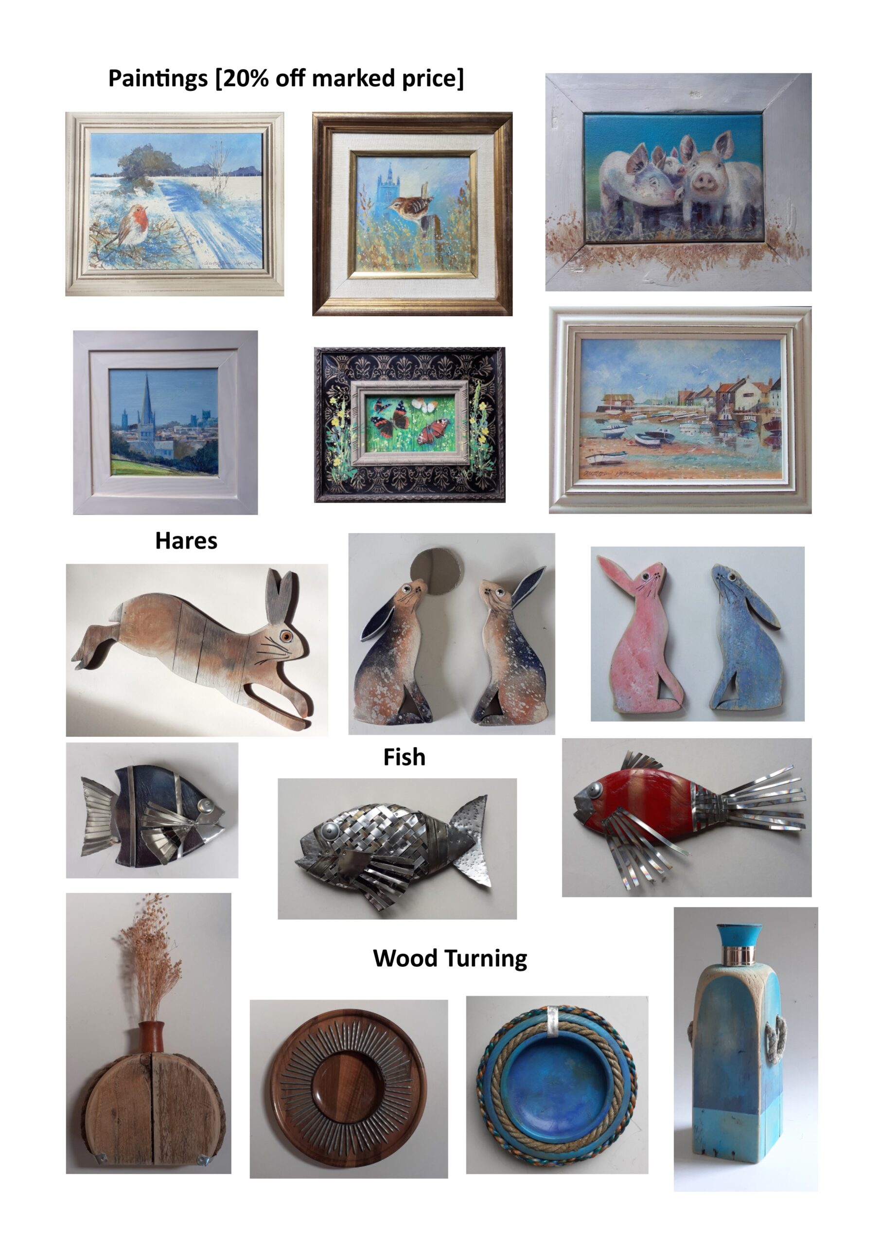
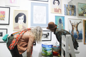
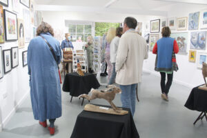
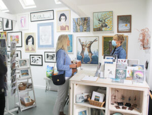 So, those few events that have gone ahead in 2020 with careful management have felt like gold dust, and one of the nicest has been the Open Exhibition at West Acre Gallery, which ran for most of September, and hosted a wide variety of 2 and 3 dimensional work from 27 local artists.
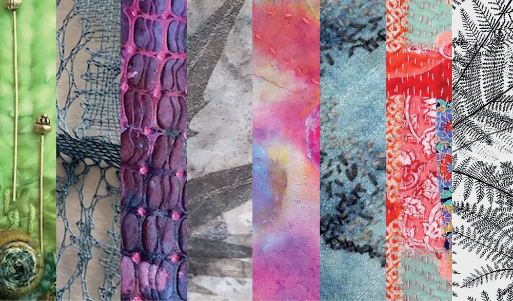
To quote the organiser, Abbey Stirling,’ In the mix we have painters, printmakers, sculptors, ceramicists, metalwork, needle felt and textile artists all bringing forth their unique skills for this mixed discipline exhibition, to showcase a truly diverse cross section of artistic talent. ‘
And on a very positive note there were a really good number of sales, both of original art works and also from the gift shop that ran alongside the main exhibition, selling cards and smaller pieces of the featured artists’ work.
West Acre Gallery is the brainchild and baby of Abbey Stirling. Conceived as community Art Gallery it is entirely crowdfunded and sits amongst the ancient ruins of a 900 year old priory in Abbey Farm, West Acre, in what promises to be a thriving local artisan community which currently includes a craft brewery, woodworkers, framers, artists and a mosaicist with more studio spaces available to let.
 It is the kind of place that promises great things in the future, while offering some wonderful things right now.
This year more than ever this event has been a real treat – a bright light in a very dark year.
I think lots of us are hoping the West Acre Gallery Open will become an annual feature – for more details about the gallery, to hire or admire it, to join their mailing list, or to find out what they have planned for the rest of the year, go and take a look at the Gallery website: https://www.westacregallery.co.uk
Sue Welfare