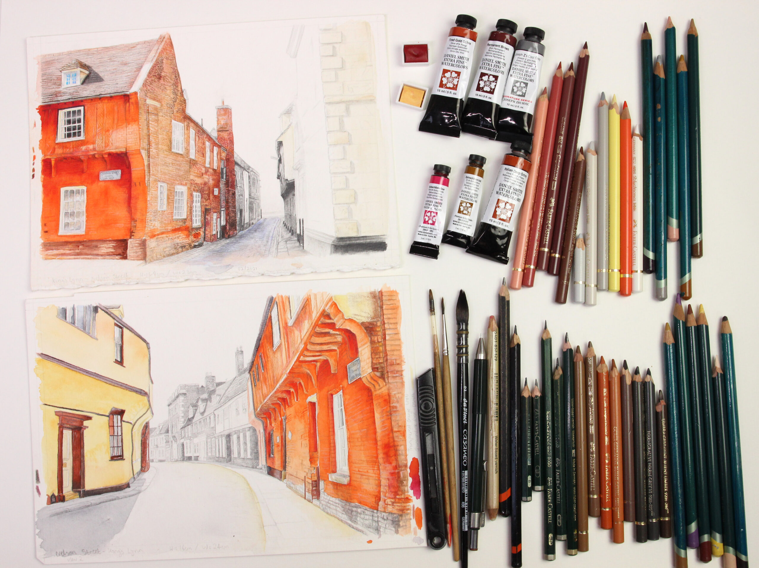
 If you happen to wander past my studio in the High Street, Heacham (Studio @ 55) you may ask yourself what exactly is going on here. The light could be on when most of Heacham is asleep. I may still be working. I have a deadline.
Each year a contemporary art exhibition takes place at Cley-next-the-Sea. Artists show their work in St. Margaret’s Church and churchyard, the NWT Visitor’s Centre or on the beach. (https://cleycontemporaryart.org/ Instagram @cleycontemporaryart)
Unfortunately, Cley 20 couldn’t take place but now, I can finally proceed with my work for Cley 21 which will take place from 1 July – 1 August.
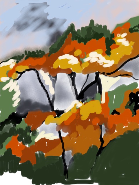
 The theme is “nowhere: not in or to anyplace, not anywhere – nowhere is now here.”
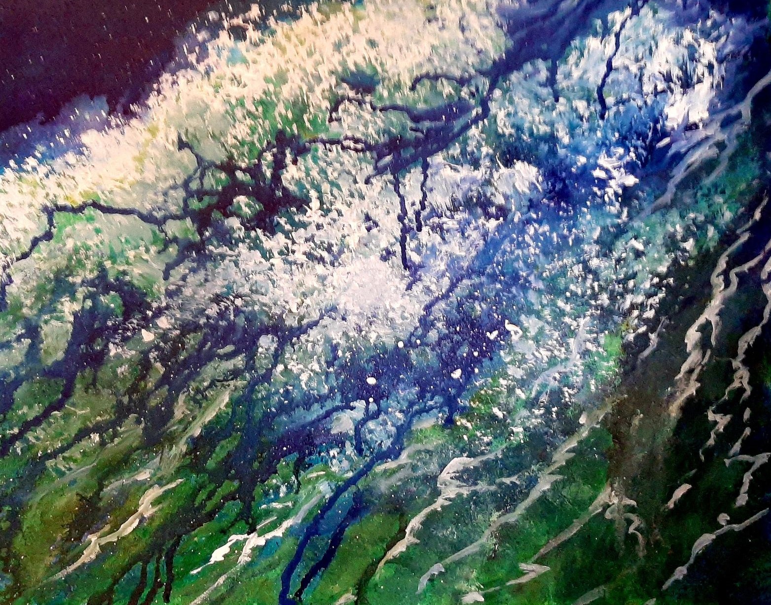
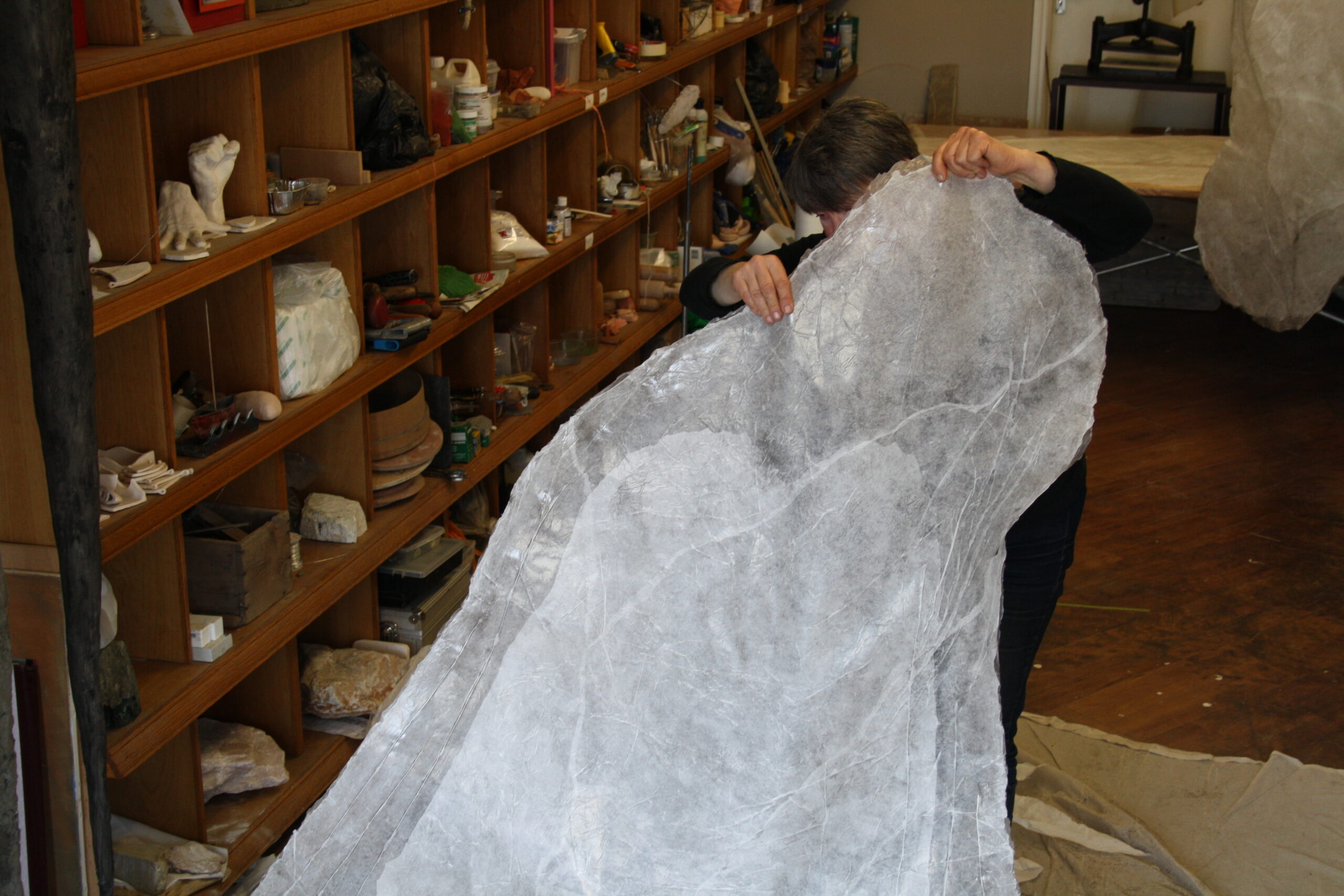
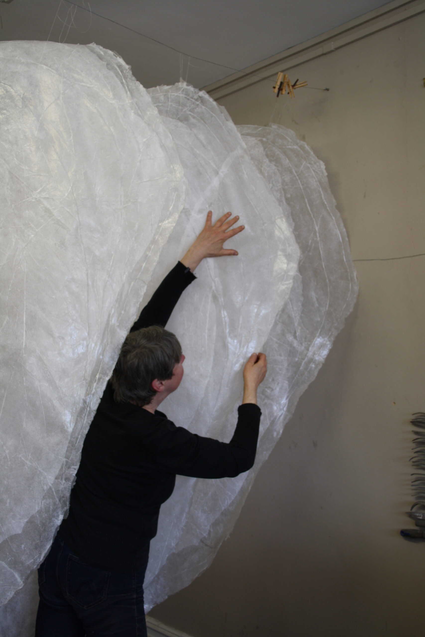
The installation piece I’m doing consists of eleven ‘skins’ that will be suspended above the baptismal font near the west window/entrance. Each ‘skin’ is made of tissue paper and acrylic medium and is approximately 2m long and 120cm at the widest point.
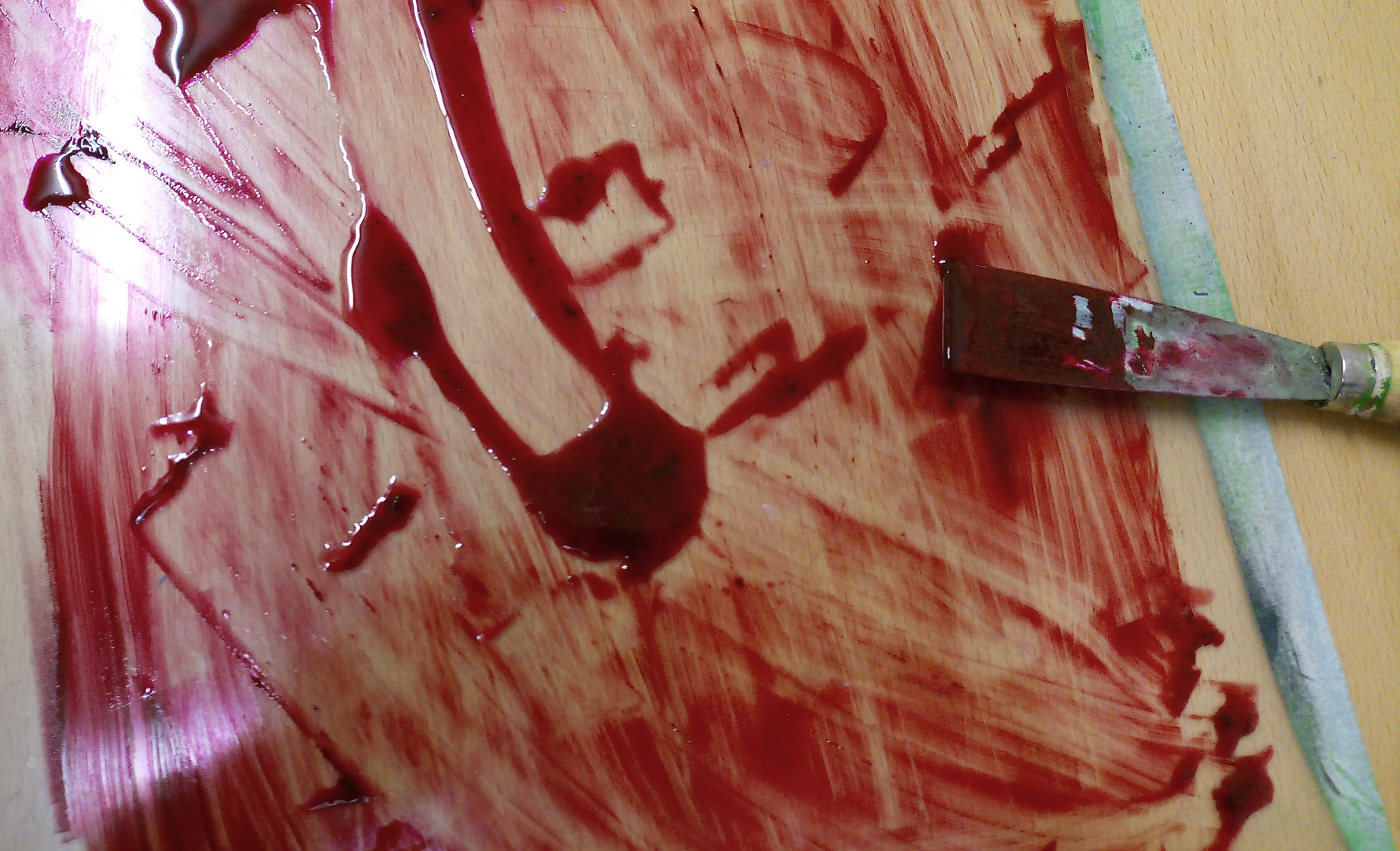
I set to work making a large form made of chicken wire and ‘Ciment Fondu’ that would serve as a mould for the ‘skins.’ They are translucent with soft edges reminiscent of alabaster or ice and will appear to be floating in space. I still have a lot of work to do before the hanging starts on 21 June, but you are welcome to visit me in my studio on Saturdays and Sundays from 10am to 1pm or by appointment.
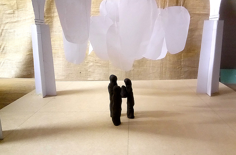
Model of installation piece. The largest figure represents a person 6′ tall.
While I’m waiting for the acrylic medium to dry, I’m working on my second installation project of the year. It’s for the Raveningham Sculpture Trail which will run from 31 July to 5 September. (https://raveninghamsculpturetrail.com/sculpture-trail-2021/ Instagram @raveninghamsculpturetrail) I will be using the same materials but suspend ‘skins’ in a tree to create a cocoon-like effect. My childhood love of tree climbing got put into practice again making the templates for the piece.
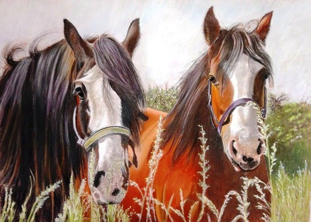
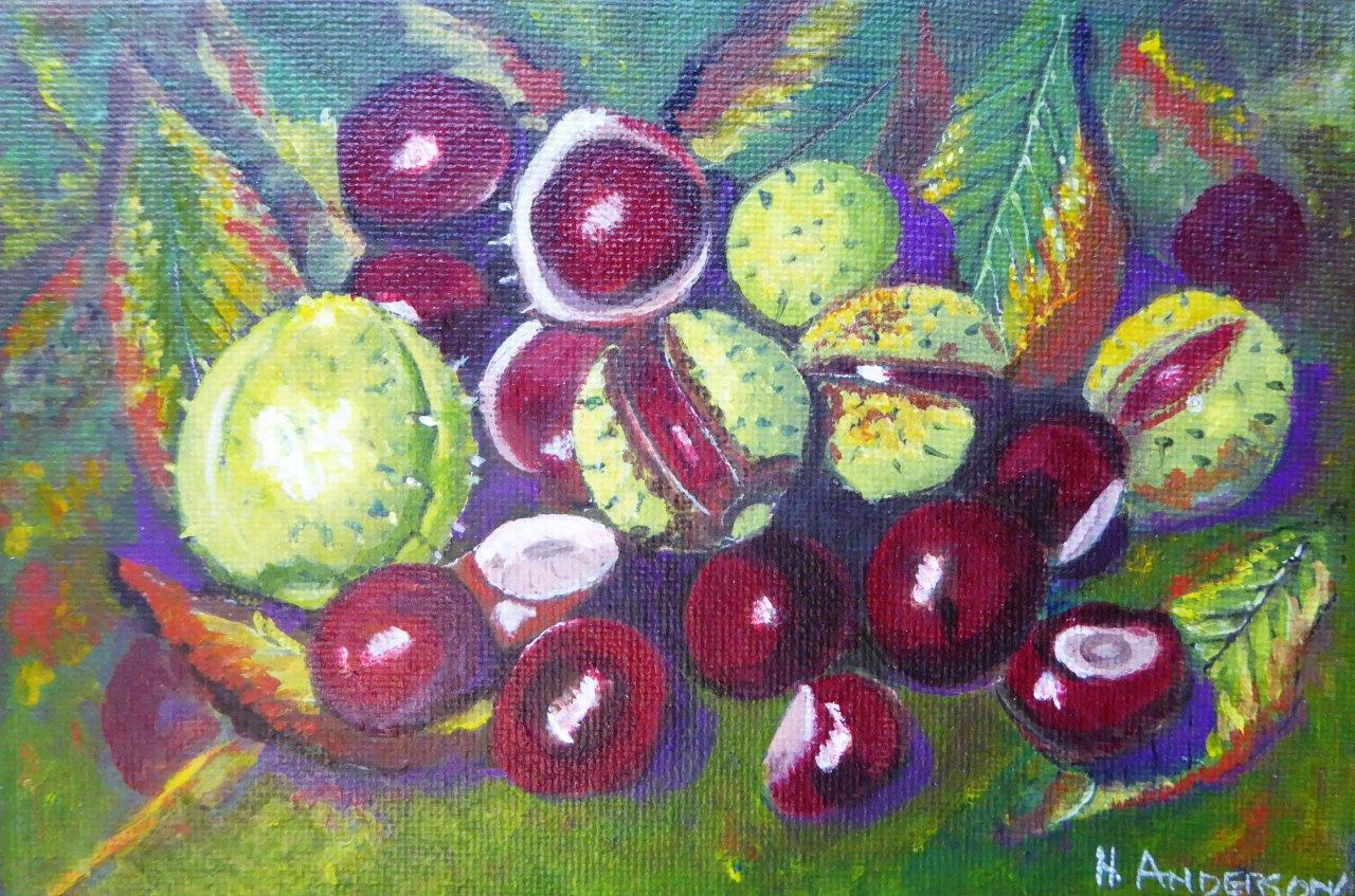
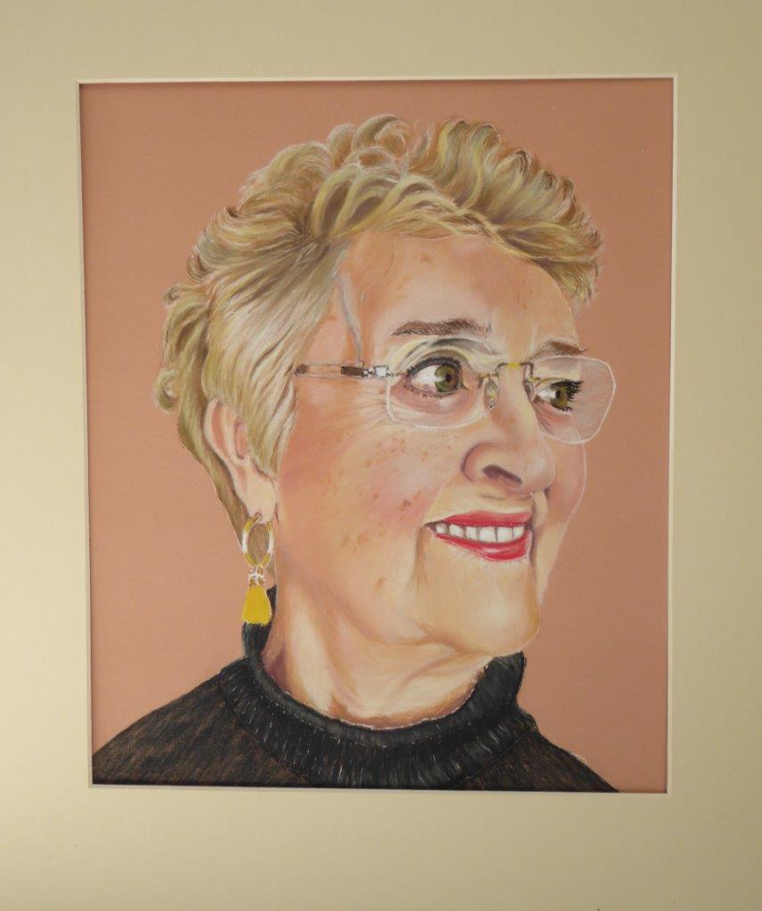
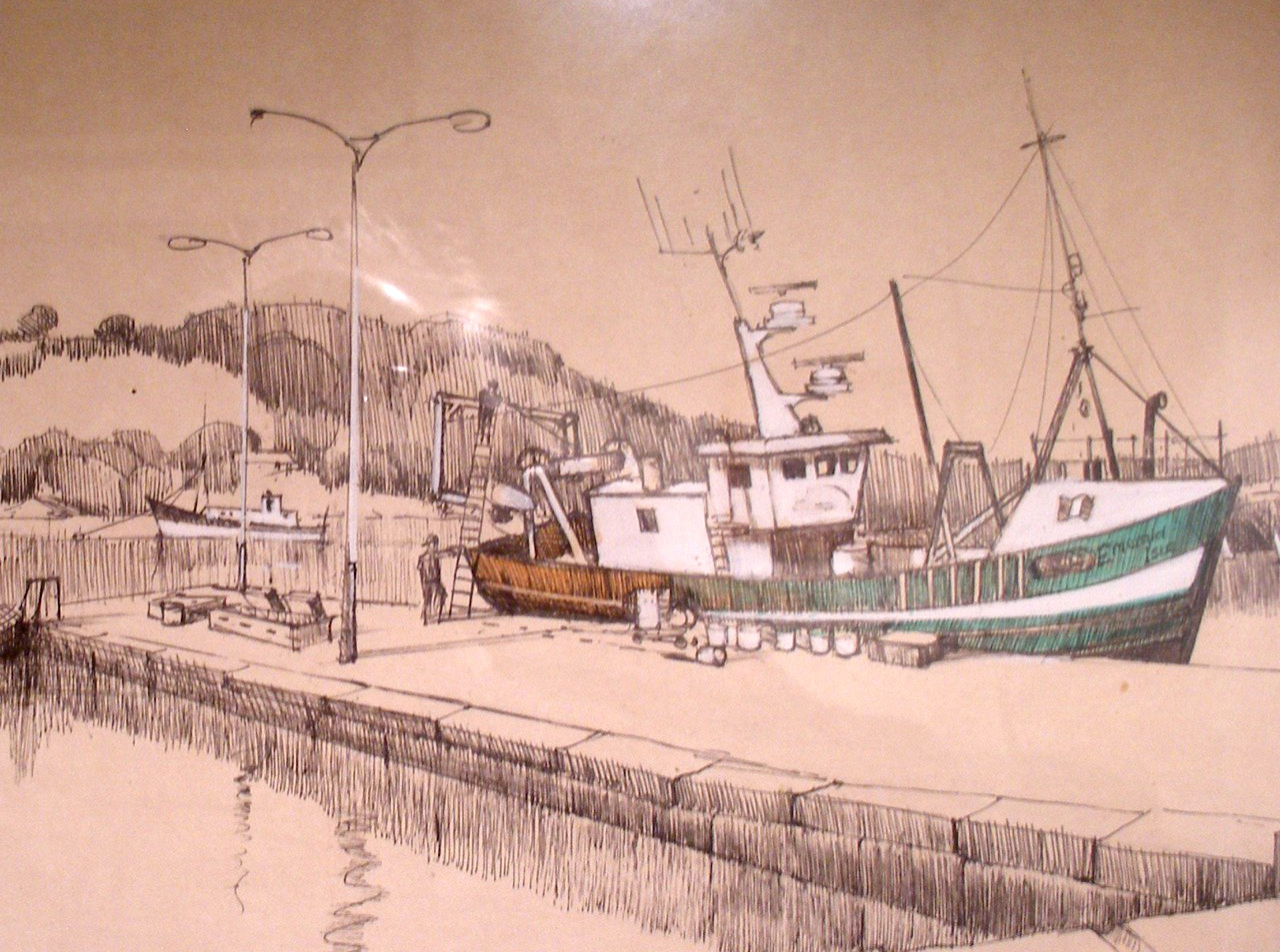
Clay Modelling is running and so is my new kiln. It’s exciting having a kiln on site and seeing student work after a firing. As things ease up, more courses will begin so please do let me know if you would like to join in. My classes are limited to 4 participants so each person can develop their own ideas with a maximum amount of support.
Esther Boehm
Further information: Esther Boehm BFA (sculpture) • Studio @ 55 • 55 High Street • Heacham, PE31 7DW
www.estherboehm.com • eb@estherboehm.com