
Signs of Life 2
Interview with Esther Boehm
YOU WERE BORN IN LONDON, WHERE YOUR PARENTS MET, BUT YOUR ROOTS LIE IN GERMANY AND RUSSIA. CAN YOU TELL US ABOUT THAT?
My father’s family emigrated from northwest Germany, then ruled by Denmark, to Estonia in the mid-nineteenth century. Many German families emigrated to the Baltic states, then ruled by Russia. My father was born in Moscow. My mother’s family were in Latvia. She was born in St Petersburg. Both families left Russia, by whatever means possible, after the Bolshevik revolution and eventually ended up in England, and in due course my mother and father became British citizens. My father ran his own engineering company, made equipment like morse-tappers for the British army during the war, and acquired product licences to exploit – like the metered dose aerosol valve which was developed for Glaxo’s Ventolin asthma inhaler by his company Bespak which I ended up running and bringing to King’s Lynn in 1975. My column on the South Quay was my celebration of 25 years in King’s Lynn.
DO YOU THINK THIS CONSTELLATION HAD AN INFLUENCE ON THE WAY YOU APPROACH THE WORLD AND YOUR ART?
I think my approach to life and art is an embodiment of a German love of precision/pursuit of perfection and a particularly Russian romanticism. Two of my favourite artists are the Russian Kazimir Malevich (epitomised by his ‘Black Square’ painting, representing the Icon in the ‘special place’ in the corner of the room) and the 19th century German painter Caspar David Friedrich (epitomised by the ‘Solitary Tree’ in the Old National Gallery in Berlin). My country of birth has given me an English sense of humour and a great love of cricket!
WHEN DID YOUR PASSION FOR ART BEGIN?
I came to art through making. I won the school handicraft prize at age 8. At school at Oundle I revelled in the compulsory one week each term in the workshops – woodworking, metalworking and foundry. I didn’t do art at school but started drawing for its own sake as a teenager and evolved from there. In my late teens I started evening life classes.
Relief inspired by Paul Gaugin.
WHO WAS YOUR EARLIEST INFLUENCE?
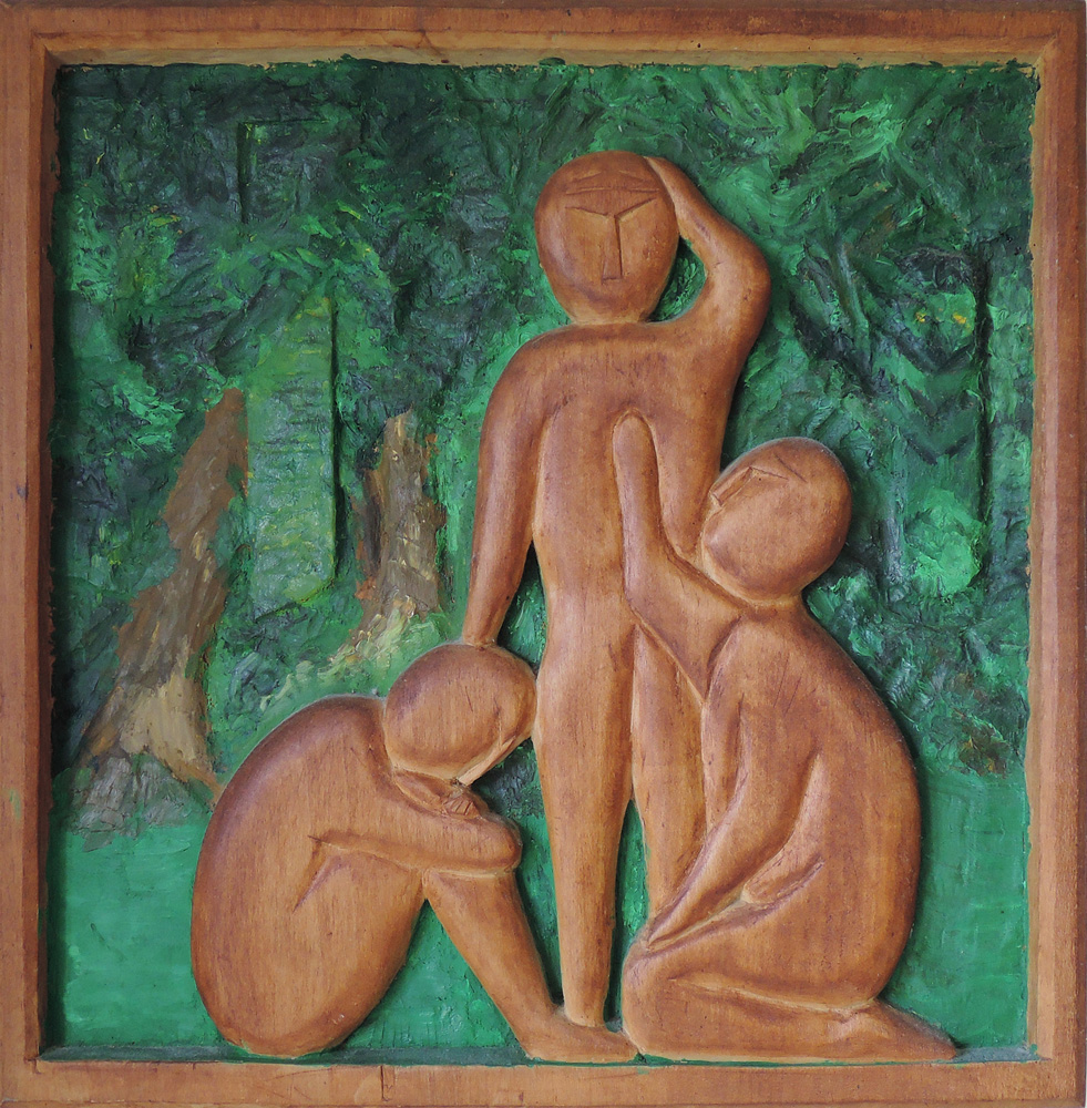
Thinking back, my earliest significant influence, when an older teenager, was Paul Gauguin, particularly his South Sea Islands work. When I had my gap year in Germany I discovered lime wood for carving and made one work I still have – after it had been in my parent’s house for nearly 50 years – made when I was 19, of three figures in a wooded landscape, referring to Gauguin’s painting “Where do we come from, who are we, where are we going”.
YOUR EARLY WORK, ESPECIALLY THE ALUMINIUM CASTS ARE PREDOMINANTLY FIGURATIVE. IS THIS THE NATURAL PROGRESSION FROM THIS EARLY INFLUENCE?
I greatly enjoyed life drawing, particularly with pen and ink and wash. In the 1980’s a number of Art Colleges, including Norwich, offered a week of five full days in the studio with lovely models and I did this in Norwich and London for several years. It greatly developed my ability to compose harmoniously in three dimensions and led naturally into my cast works. I sent myself on a mould making course so that I could turn clay models into plaster maquettes, which I could then carve in polystyrene in greatly enlarged size for casting in aluminium. I learned about ‘lost polystyrene casting’ when, for several years, we took our children to the Summer School at Loughborough College which ran courses for all ages, including aluminium casting in the Art College.
WHO WERE OTHER MAJOR INFLUENCES IN YOUR WORK?
Jean Arp. His drawings and collages (I am lucky enough to have a small one at home) as much as his sculpture. I realised after a while that his Dadaist work had given me permission to flow the way I wanted to go!
Aluminium Relief
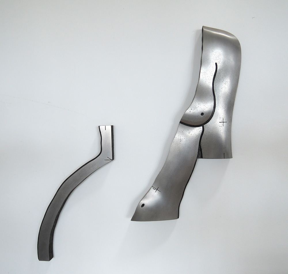
IN THE EARLY 90S YOUR WORK STARTED MOVING OFF THE FLOOR AND GAINING LESS FORMAL SCULPTURAL TECHNIQUES. WAS THERE A PARTICULAR REASON FOR THIS?
I made quite a number of large figurative works, which were shown in my first exhibition, in the Fermoy Gallery in 1989. As I have often found, my mind moves position without any conscious decision making. In the early 1990’s my mind (which I listen out for!) was telling me to move up off the floor and onto the wall – still figurative but moving towards abstraction. There is one work still in my studio which is typical of the first steps in the change. The left hand of the two elements is completely flat and both elements have markings on them as if they were made from an engineering drawing – an early reference to the contrast/conflict between natural and mechanical.
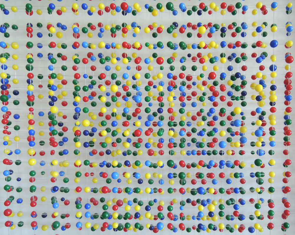
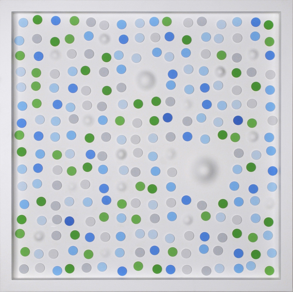
Chaotic Symmetry — Detail
YOU PURSUE A FASCINATION WITH RANDOM NUMBERS WHICH ARE PRECISELY TRANSLATED INTO BEAD WORKS LIKE ‘CHAOTIC SYMMETRY’. NUMBERS FROM 1-9 ARE ASSIGNED TO VARIOUS BEAD SIZES WITH THE COLOURS OF RED, YELLOW, BLUE AND GREEN. SOME PEOPLE MAY ARGUE THAT THIS HAS MORE TO DO WITH MATHEMATICS OR ENGINEERING THAN ART. WHAT IS YOUR VIEW?
A long time ago I encountered the writings of Stephen Jay Gould, which proved to be a revelation. In his essays he writes about life systems and processes, and particularly about Darwinism and Darwin’s ‘dangerous idea’ – a single branching tree of life, evolution via a mindless algorythmic process. This leads into wonderful books by Richard Dawkins, like ‘Unweaving the Rainbow’ and ‘Climbing Mount Improbable’. It all forms a background to my work, about nature and the materials and processes of our universe. About randomness and order out of chaos. I use collected leaves, unchanged except for size, as my representatives of life systems. Glass beads as arrays of atoms. Organic shapes as suggestive life forms. I like Socrates saying that ‘wisdom begins with wonder’. I am wandering and wondering at life around me, and treasure hunting for significant elements to use – like characterful leaves, the spikes on the trunk of the Kapok tree, the perfect thorns on a bramble and – particularly – that chaos (represented by the application of random numbers) can occasionally lead to exquisite order!.
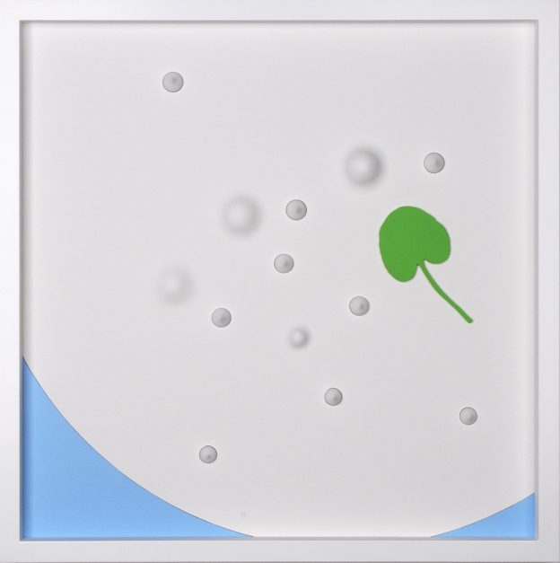
Quantum Disturbance 7
MORE RECENTLY, WORKS LIKE ‘QUANTUM DISTURBANCE 7’ USE THIS PRINCPLE BUT INCORPORATE FLAT DISCS AND BULGES. THE SOFT BULGES SEEM TO RANDOMLY SURFACE EFFECTING THE POSITION OF THE DISCS AROUND THEM CAUSING AN UNEXPECTED DYNAMIC. ARE THESE 2 RANDOM SEQUENCES MERGED TOGETHER? WHAT ARE YOU TRYING TO ACHIEVE?
To me they are resolved into an energetic harmony balanced around the largest bulge which which sits approximately on both the horizontal and vertical ‘golden sections’ – an object for mental immersion and contemplation. The arrangement of disc colours/tones is important, to give feelings of advancing and receding. But in the end look at the big bulge and hear the hypnotist’s words: ‘look into my eyes………..’
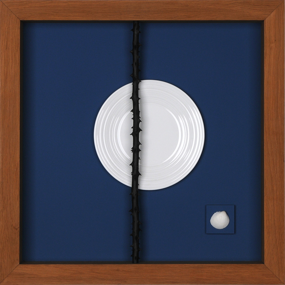
Perfect Design
IS ‘PERFECT DESIGN’ TYPICAL OF THE CONCEPTUAL ELEMENTS OF MOST OF THE WORK?
There are conceptual elements in all of the works, even if they look very different. The clues are in the titles. I don’t think up titles, they just jump into my free-ranging brain and announce themselves! ‘Perfect Design’ is just that. Nature designs with varying perfection as does the human brain. A completely different visual approach is embodied in ‘Genesis 4’: the collected Garlic Mustard leaf, the organic Arp-like shapes, the random green elements offset by the contrasting magenta discs and the hazel leaf background resolve into a Norfolk coastal landscape.
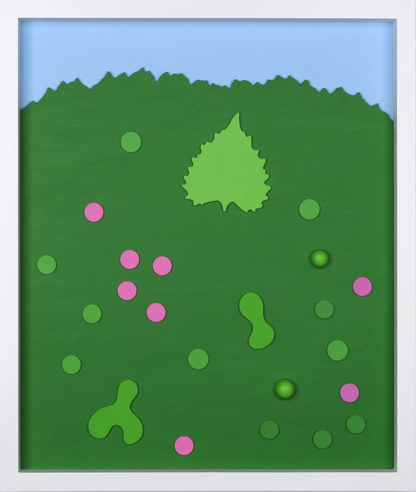
Genesis 4
TELL ME ABOUT YOUR BLUE, GREEN, MAGENTA PALETTE. WHY THIS DELIBERATE RESTRICTION?
At first it was polished aluminium, then black and white. When I started using colour I found I was favouring nature’s green and blue of sea and sky. I then wanted a colour that related to them actively and passively. I thought (on the standard primary/secondary triangles) that I wanted a colour between blue’s partner (on the other side from green) – purple, and green’s opposition – red. Between purple and red is magenta. I found this gives me what I want. I use very matt paint (no painterly brush marks!) – Dulux Diamond Matt. A very good colour range. I have a dark and a light green, two or three blues and two magentas (one slightly more purple, one more red). I mix the greens to give intermediate tones, and lighten the blues and magentas with white. I have occasionally used other colours, particularly sulphur yellow and black, using a very matt old French acrylic I found at Cornelissen’s called Flashe.
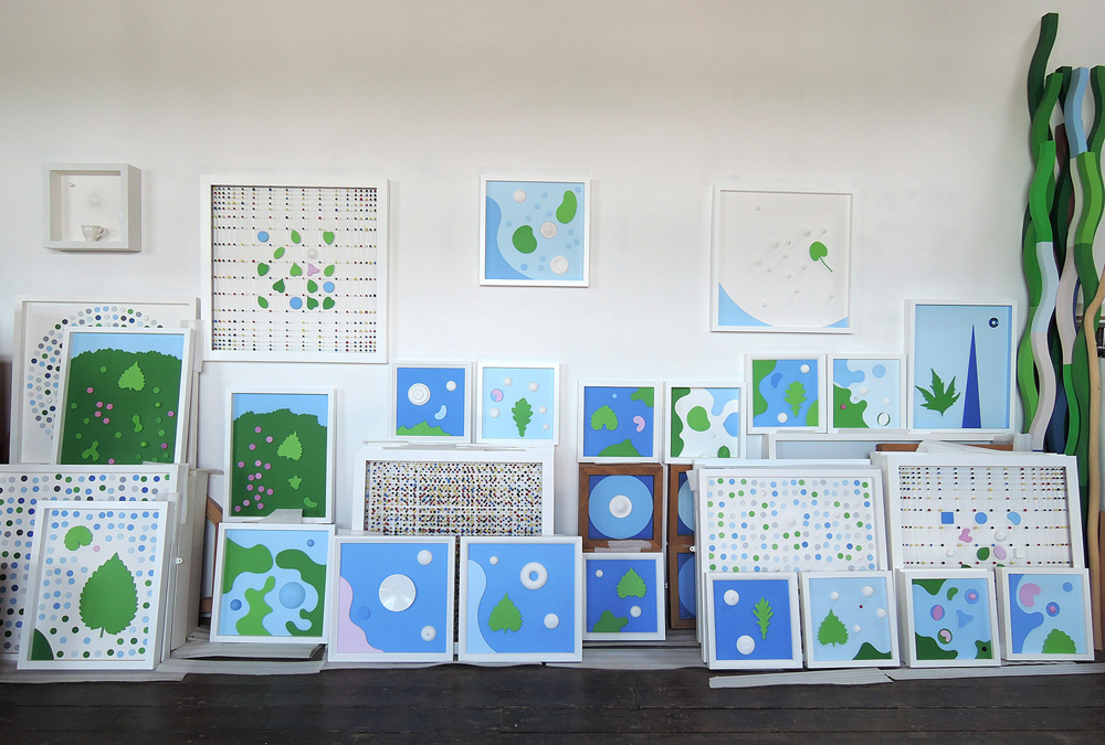
Positive resonance of Andrew’s studio.
ARE ALL YOUR WORKS CAREFULLY PLANNED IN ADVANCE AND CARRIED OUT ACCORDING TO PLAN?
I used to fully work out the arrangement of elements of a piece – essential when casting! I have drawing books with fully resolved pieces. But in recent years I may start with a drawing, make some of the elements, contemplate, change bits, edging towards resolution. When a work is finished I look at the work over days or months, and sometimes get a feeling of not being quite right! I make a change. Sometimes several changes until finally – yes, that’s it! The iterations happen more frequently now – is it age?
IN YOUR STUDIO I WAS SURPRISED TO SEE WORKS BY BERNARD MENINSKY AND KEN KIFF BECAUSE OF THE CONTRAST TO YOUR WORK.
Artists like Bernard Meninsky and, particularly, Ken Kiff I respond to emotionally – the free
form, the colours – but I don’t think they influence my work. I have a lovely 1930
watercolour of flowers on a table by David Jones at home – very free and delicate.
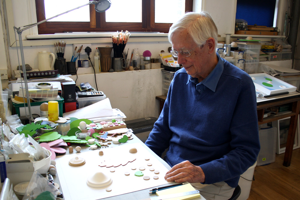
The intensely thoughtful Andrew Schumann.
YOUR WORK HAS MOVED THROUGH VARIOUS PHASES, IS THERE AN UNDERLYING THREAD THAT HOLDS ALL THESE PHASES TOGETHER?
Not a conscious one. But pleasure that my mind keeps taking me to new places.
Andrew Schumann read History of Art for his degree at Cambridge. Later, after running Bespak in King’s Lynn for 10 years, he became a full-time artist and acquired his studio on Purfleet Quay in which he could install a larger furnace for aluminium casting.
Contact Andrew
07766 141302
andrewschumann@btinternet.com
andrewschumann.com